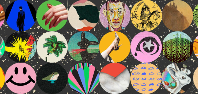
As is now Literary Hub tradition, I am pleased to present the best book covers of the year–as chosen by some of the industry’s best book cover designers.
Article continues after advertisement
This year, I asked 54 designers to share their favorite covers of the year, and they came back with a grand total of 167 covers (NB: for the purposes of this list, series concepts will be counted as single covers), representing work by 105 different designers for 83 different imprints at home and abroad. This year, there was somewhat less consensus than usual–the first place citation only got 8 mentions, compared to last year’s 12, and only 62 covers were selected by more than one designer, leaving over 100 selected by only one–which ultimately just means we have more exciting book covers to look at than ever. All of the designers’ choices, and their comments, are below.
But first . . . the stats.
The best of the best book covers:
First place (8 mentions):
Jeff VanderMeer, The Southern Reach series (10th Anniversary redesign)
design by Pablo Delcan (Picador, July)
*
Second place (tie–7 mentions each):
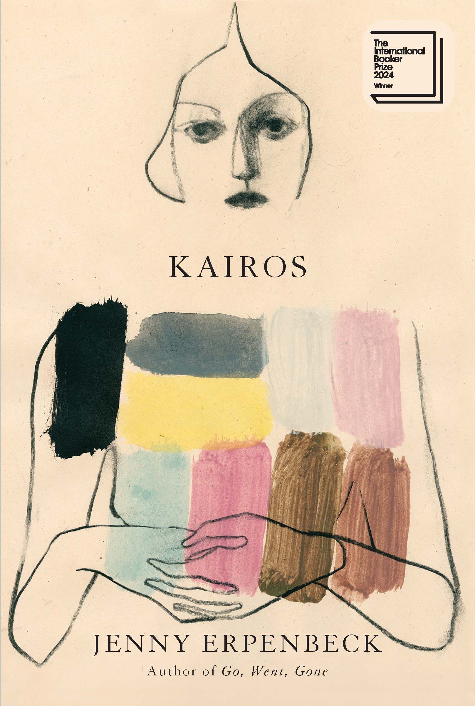
Kaveh Akbar, Martyr!
design by Linda Huang (Knopf, January)
Liz Moore, The God of the Woods
design by Grace Han (Riverhead, July)
*
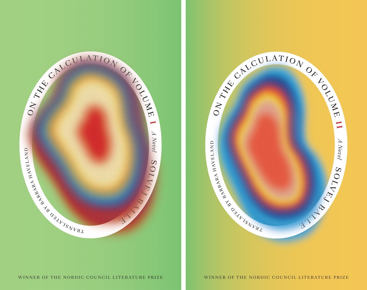
Third place (tie–6 mentions each):
Solvej Balle, tr. Barbara J. Haveland, On the Calculation of Volume (Books 1 & 2)
design by Matt Dorfman (New Directions, November)
‘Pemi Aguda, Ghostroots
design by Sarahmay Wilkinson, art by Day Briere (W.W. Norton, May)
*
The presses with the most covers on the list:
First place:
New Directions (14 books)
*
Second place:
Knopf (7 books)
*
Third place (three-way tie):
Riverhead (6 books)
Astra House (6 books)
FSG (6 books)
*
The designers with the most different covers on the list:
First place:
Alex Merto (6 covers)
*
Second place (tie):
Luke Bird (5 covers)
Janet Hansen (5 covers)
*
Third place (tie):
Tyler Comrie (4 covers)
Suzanne Dean (4 covers)
*
The best month for book covers:
First place:
September (23 covers)
*
Second place:
October (22 covers)
*
Third place:
July (20 covers)

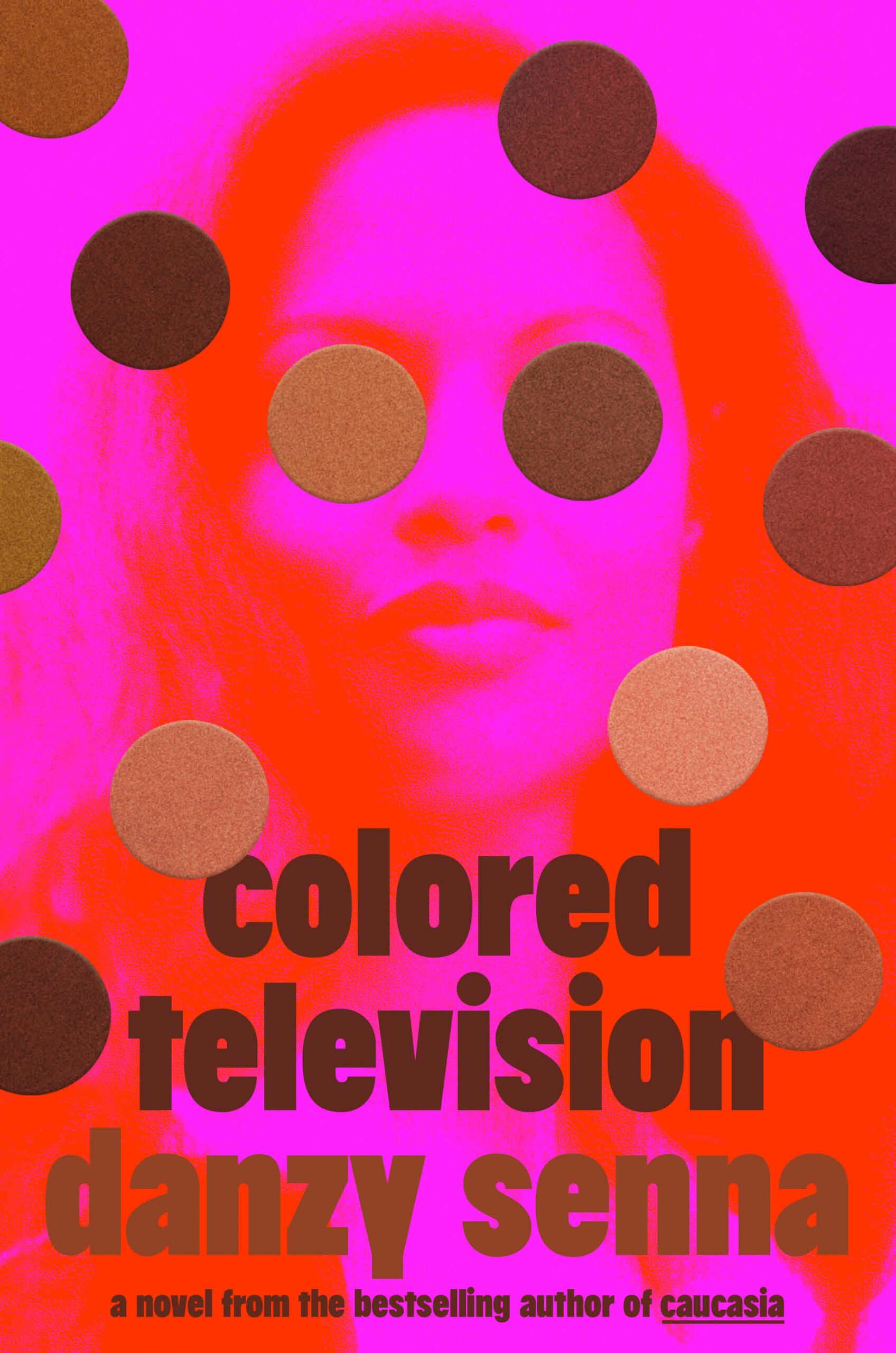
If you hand Pablo Delcan a brief that includes “biological contaminants,” “peculiar creatures,” and a greenlight for holographic foil, he’s going to knock it out of the park. That fact is as immutable as there will be weather tomorrow. These covers are unlike any others I’ve seen and their hideous beauty feels perfectly matched to the writing.
–Jason Arias
This new cover and series redesign fit the books so well…the holographic foil! The distorted animals! I can’t get over it.
–Jaya Nicely
The whole trilogy is a work of art. This cover is brilliant, beautiful and terrifying.
–Anna Morrison
Perfectly weird covers to match its perfectly weird contents. Such a good blend of creepy and beautiful.
–Dana Li
It is so striking. The use of foil is not redundant but adds to both theme and effect.
–Joan Wong
Incredibly weird, which is so right for this series of beautifully and deeply weird, opaque books.
–Mark Abrams
Mesmerizing art ✔️, holographic foil ✔️, sculpt emboss ✔️. This one is for the collectors.
–June Park
I am very jealous that Pablo got to design this cover. But I am not mad because it’s so good. But Pablo if you’re reading this, I am jealous of you.
–Erik Carter
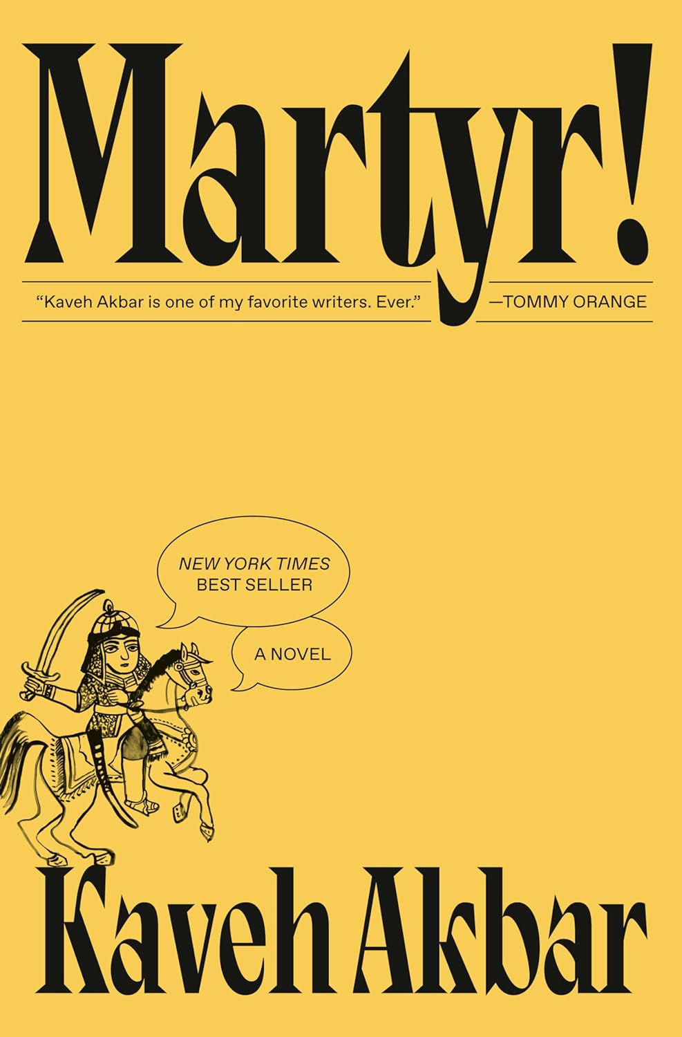
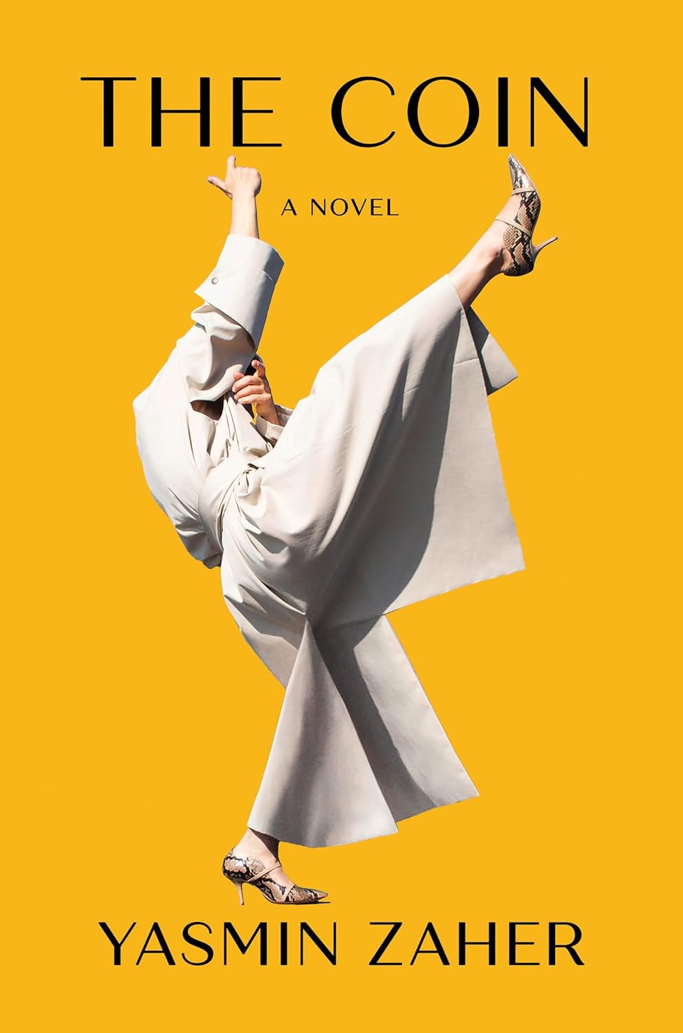
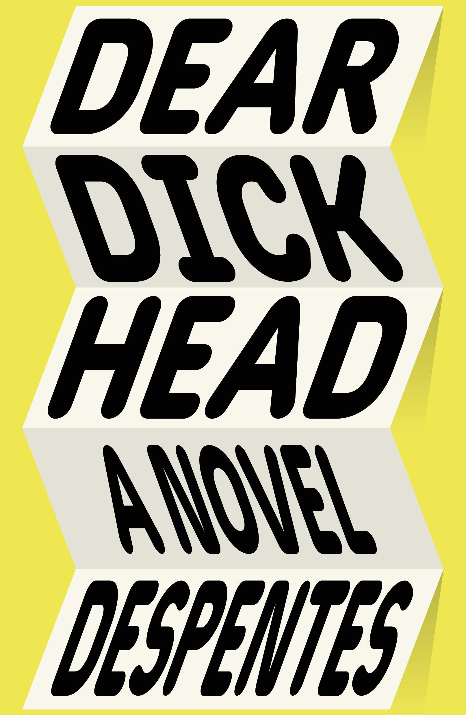
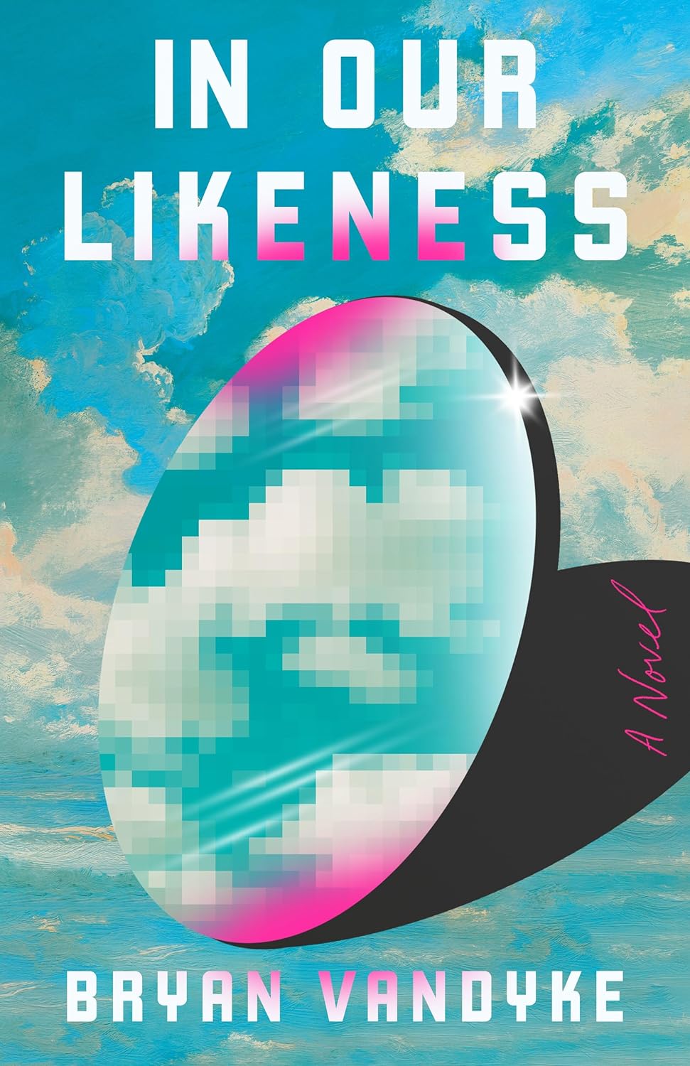
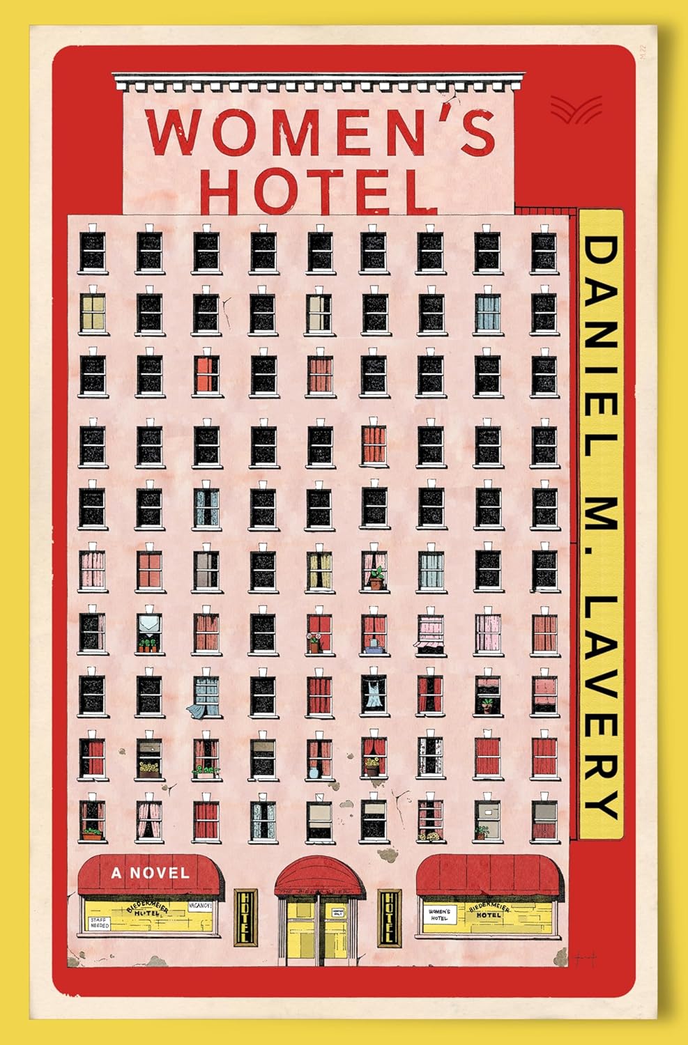
The figure saying “a novel” was perfect, but the addition of “New York Times bestseller” in a speech bubble took this to a whole new level.
–Stephen Brayda
Great use of negative space. Clever way to add a bestselling line.
–Joan Wong
Eye-catching! Minimal! Negative space!
–Vivian Lopez Rowe
Boldness and restraint in equal measure—an instant classic.
–Devin Grosz
Iconic.
–Arsh Raziuddin
Martyr! by Kaveh Akbar succeeds in making its 2-color palette feel rich. And like Model Home it feels like a throwback, but refreshed for 2024. The oversized, condensed serifs are as sharp as the cartoon character’s blade ought to be! I love that the publisher embraced the designer’s restraint—leaving all that bare, unexamined space for the main character and reader to explore.
–Charlotte Strick
Martyr! was the most memorable cover of the year for me. So fun and perfect in every way.
–June Park
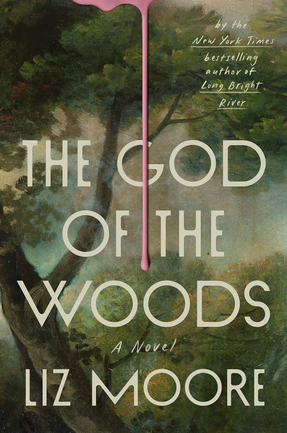
This one has already been comped a million times in our cover meeting, for good reason! I also loved the read and understanding the symbolism of the pink paint drip made me love the cover even more.
–Cassie Gonzales Vu
After reading this book—I love the pink drip for what it represents. So subtle, a little creepy, and just hits the mark.
–Kelly Winton
I’m sure this will top the lists everywhere. There is something about that bubble gum pink drip on the green painting that no one can stop thinking about. Am I supposed to feel this way?…I’m not sure of the feeling I’m feeling when I look at that drip.
–Robin Bilardello
This cover manages to hit so many notes—it’s atmospheric, taut, beautiful, ominous, inviting. An incredible balancing act.
–Lauren Peters-Collaer
I was instantly inspired to learn more about the book and to see if I could gleen what that perfect clean pink drip represented. I did not figure that out of course but I was brought to the purchase page, which is a win. This design is toggling the thriller and literary fiction crossover genre so well with the wise use of this particular typeface. I also love how the art extended itself well to the publisher’s marketing materials.
–Nicole Caputo
That pink drip! It’s perfect.
–Emily Mahon
Love the contrast of imagery here, and the use of vertical space. Don’t think I’ve seen classical oil painting upcycled like this before, and in such a satisfying, tactile way.
–David Litman
If there was such a thing as an anti-2024 book cover, this is it. No large type or remnants of a human element,
yet still so emotional and warm. I’m both in awe and my heart is sinking. Love it, a lot.
–Janet Hansen
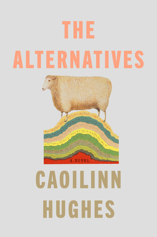
A colorful little squiggly thing, circumscribed by a ribbon of type: how else do you calculate volume?
–Matt Chase
A really lovely series design, so soft and warm.
–Ben Denzer
VERY classy gradients.
–Joan Wong
I’m already a sucker for time loops; this dizzily otherworldly constrained/unconstrained aura seals the deal.
–Mark Abrams
Love the mix of organic and geometric forms here. Plus small type working beautifully. The design speaks volumes!
–David Litman

On first glance I was convinced this was a Jane’s Addiction album from the 90s. Surprise, it’s not. And after a playlist deep-dive I could not find anything remotely resembling it, but still can’t shake the familiar feeling, which tangentially fits the theme of being haunted by the past. I love the dark fairytale imagery, block print border, and stretched type.
–Jason Arias
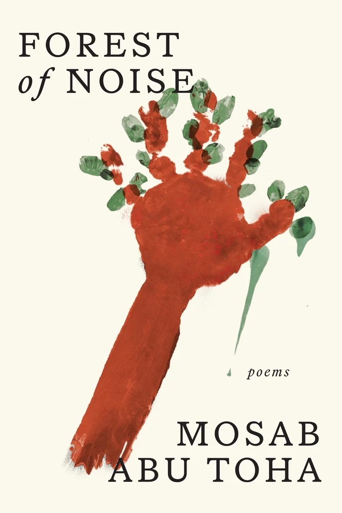
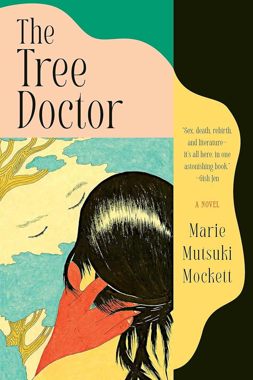
In this first year of AI overlord/overload, I feel myself yearning for evidence of the human hand—and this cover delivers. The bold, commanding typography feels refreshingly unconventional, and that pop of red in Day Briere’s art is the perfect finishing touch. My fave cover of the year.
–Milan Božić
The textures and patterns of the illustration are gorgeous, and the minimal colors are used so well. The type mirrors the energy of the illustration while still letting it shine. It all comes together so beautifully.
–Dana Li
Really wonderful execution and use of art and ornament. The simple choice of setting “Ghost” in a more condensed face brings this design to life.
–Linda Huang
I love the poster-like effect of this composition. The type treatment beautifully compliments the art without overpowering it.
–Alison Forner
The cover for ‘Pemi Aguda’s story collection Ghostroots took me back to my art school days of hoarding woodblock-printed alphabets and seeking their digital variants with names like Poplar and Oak. I was charmed by the designer’s instinct to combine that chipboard-esthetic with African ornament and full-color illustration. The sweet fawn resting in a bed of Ben-Day dots begged me not to pass it by.
–Charlotte Strick

Smart! Cheeky!
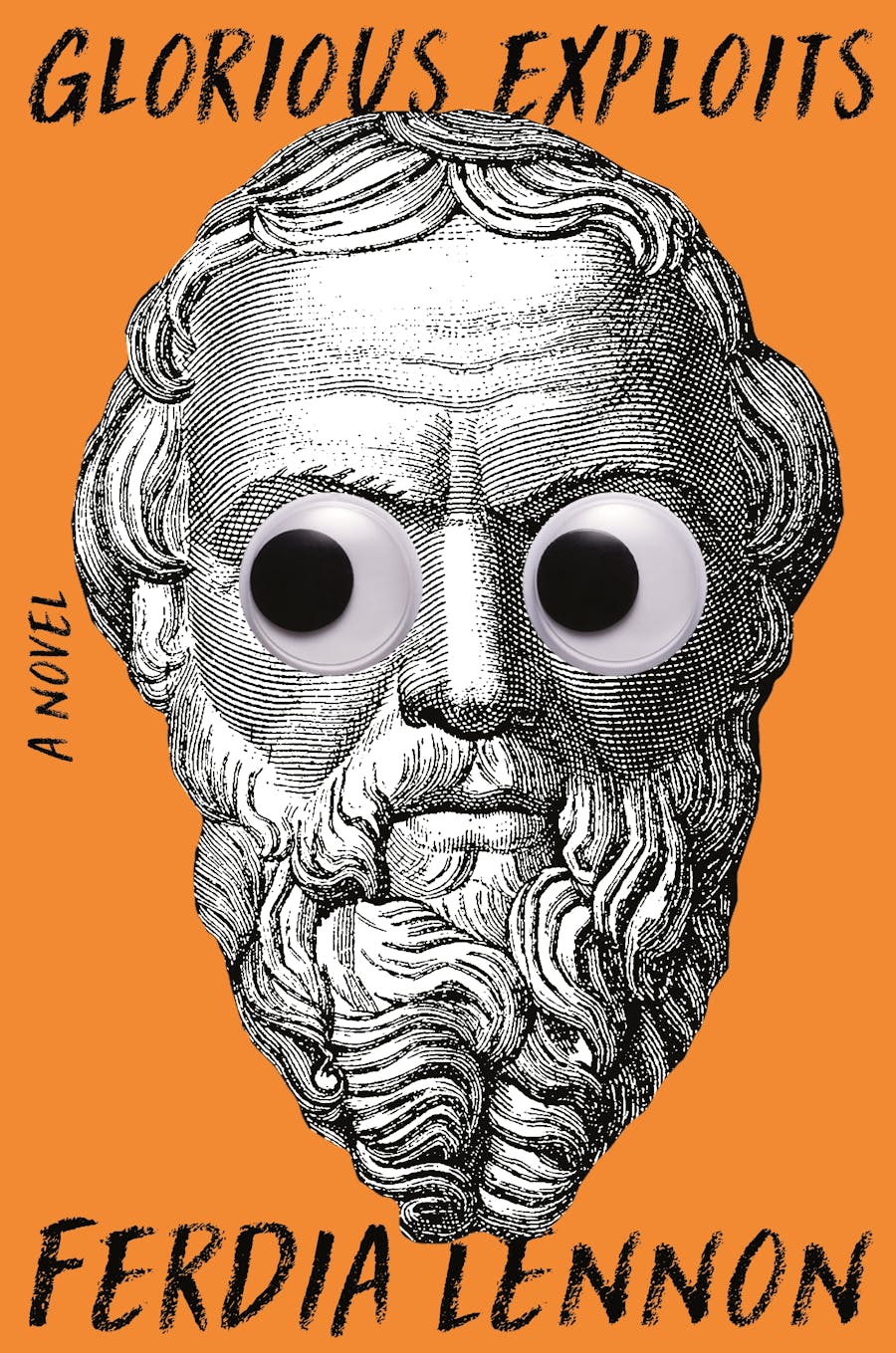
–Janet Hansen
Butt!
–Erik Carter
Nice bum.
–Anna Morrison
Bottoms up.
–Mark Abrams
Just when I thought I didn’t need to see any more pink background covers…perfect!
–Math Monahan
The photocopied paper effect lends a gritty tone. Fun, irreverent imagery and color palette.
–Kimberly Glyder
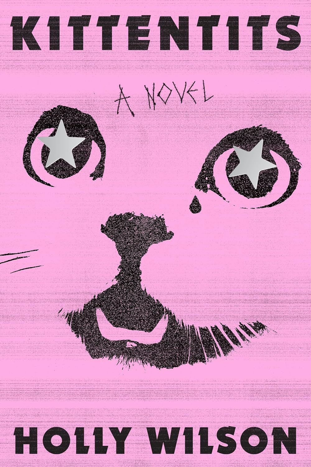
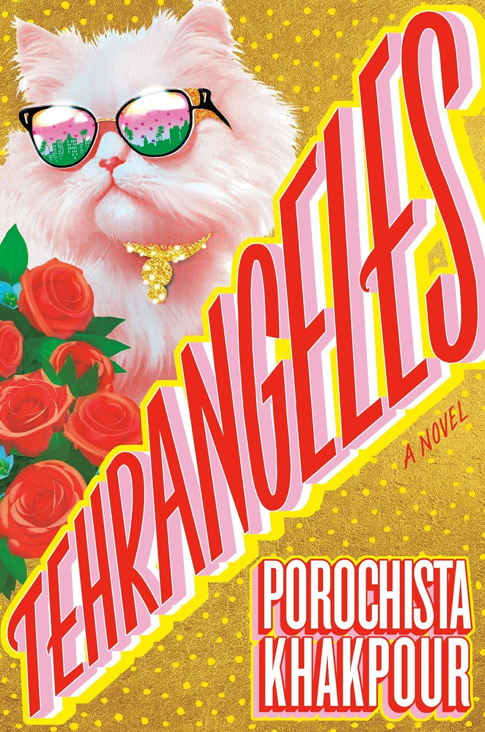
So fun, so punk and I love a cat reference 🙂
–Kelly Winton
I love the retro xerox/90s feel here.
–Lauren Peters-Collaer
Perfectly encapsulates the vibe of a xeroxed, 90s zine.
–Beth Steidle
The gritty xeroxed texture, the cat face with single tear, and the restrained palette is all so good, alongside that amazing title.
–Emily Mahon
This cover completely captivated me from the moment I first saw it. I’m confident this will be the crowd favorite. From the inventive hand-made type to the art selection and color palette, everything just works.
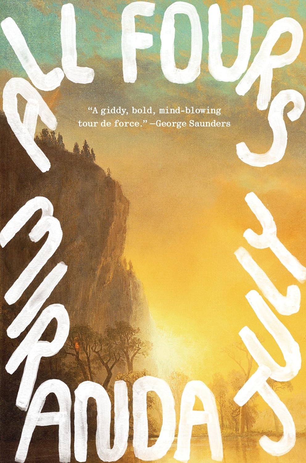
–Milan Božić
The type takes you on a tour around the cover and then becomes a gateway to the painting lying beneath, it’s perfectly balanced.
–Jack Smyth
I love how the hand drawn type pushes out to become a frame.
–Ben Denzer
I love how considered the lettering is, yet it also feels so loose and spirited. The juxtaposition of painted modern type with the classical painting makes it so eye catching.
–Emily Mahon
Sublime.
–Mark Abrams
Dynamic, beautiful use of typography to create movement and depth.
–Kimberly Glyder
I love the overall simplicity of this design and the color palette. The subtle mashing of time periods in the different elements is so clever!
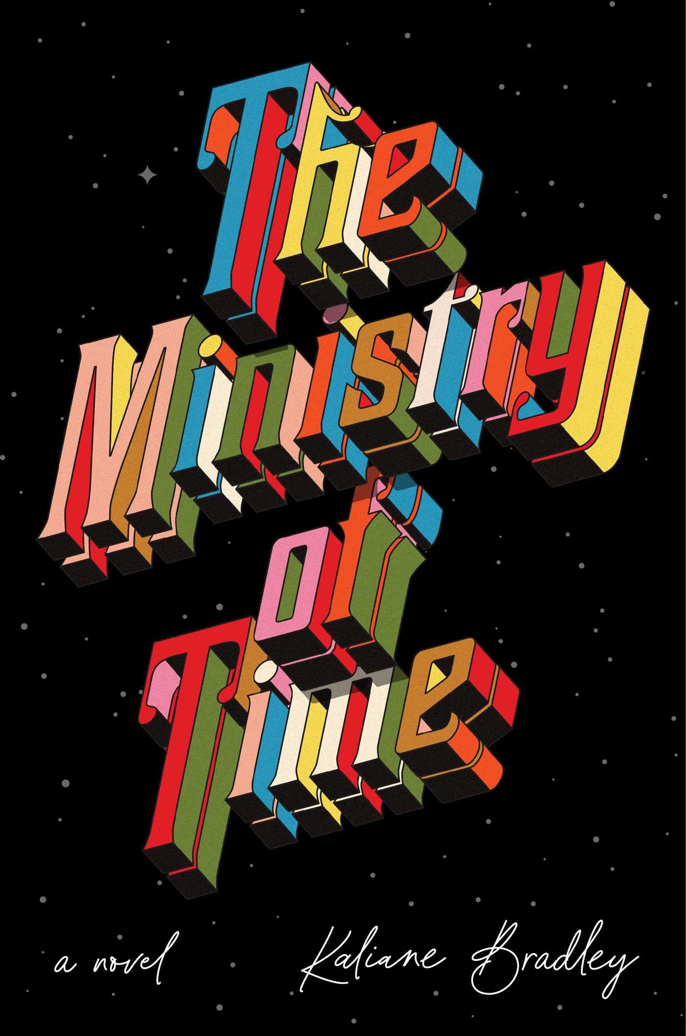
–Lauren Harms
Love this 3-D type treatment floating in space.
–Jaya Miceli
Favorite cover and favorite type of year!
–Jenny Carrow
I’m always a sucker for 3-D typography. This is my new favorite. Sorry, Breakfast of Champions.
–David Litman
Brave and satisfyingly brilliant.
–Luke Bird
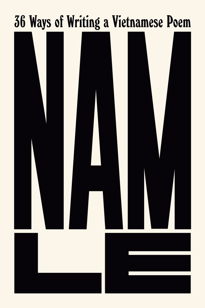
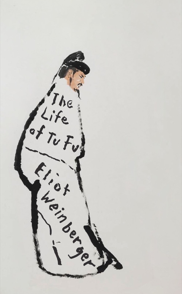
I said this almost a decade ago, and I’ll say it again: Janet communicates so much with the barest of moves. The oversized letterforms of the author’s name make a powerful statement about identity. I love the way they contrast beautifully with the small, curvy title. Paired together, they are a work of art—a Franz Kline painting.
–Linda Huang
I’m just a sucker for a well-executed all-type cover.
–Alicia Tatone
NAM. VIET NAM. BIG TYPE? GOOD.
–Erik Carter
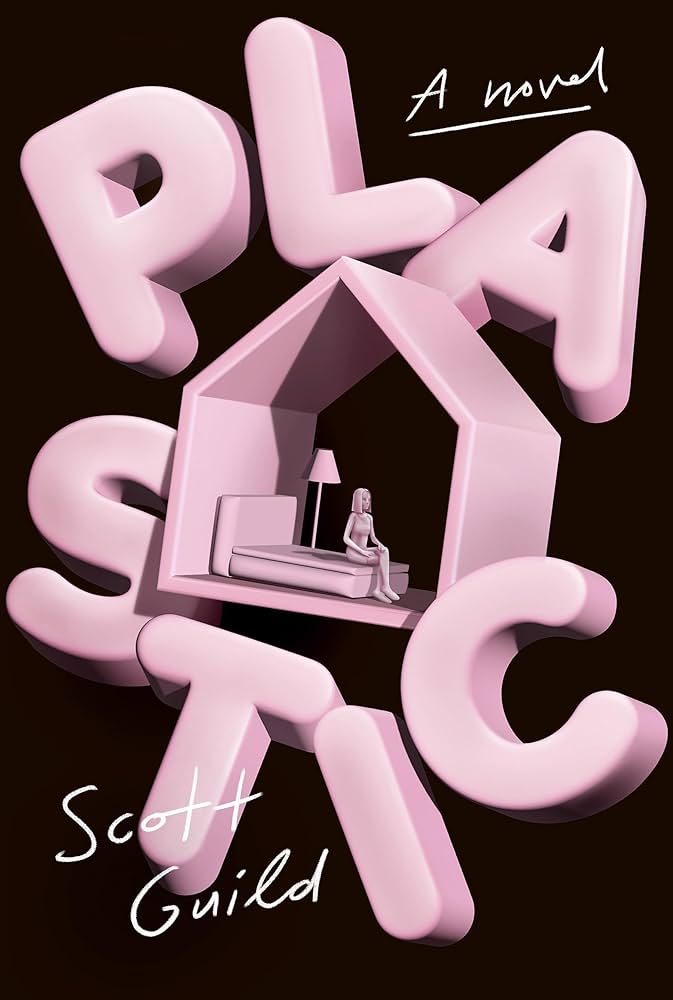
I love how playful this is, and the way the chunky letterforms dance around the plastic house.
–Dana Li
An obviously perfect concept executed perfectly. The weirdness of the ‘sim’-like woman sitting at the edge of the bed really gets me.
–Kate Sinclair
Tyler is so versatile. This is very clever and fresh.
–Joan Wong
This concept is fun, fresh, and so well executed.
–Emily Mahon
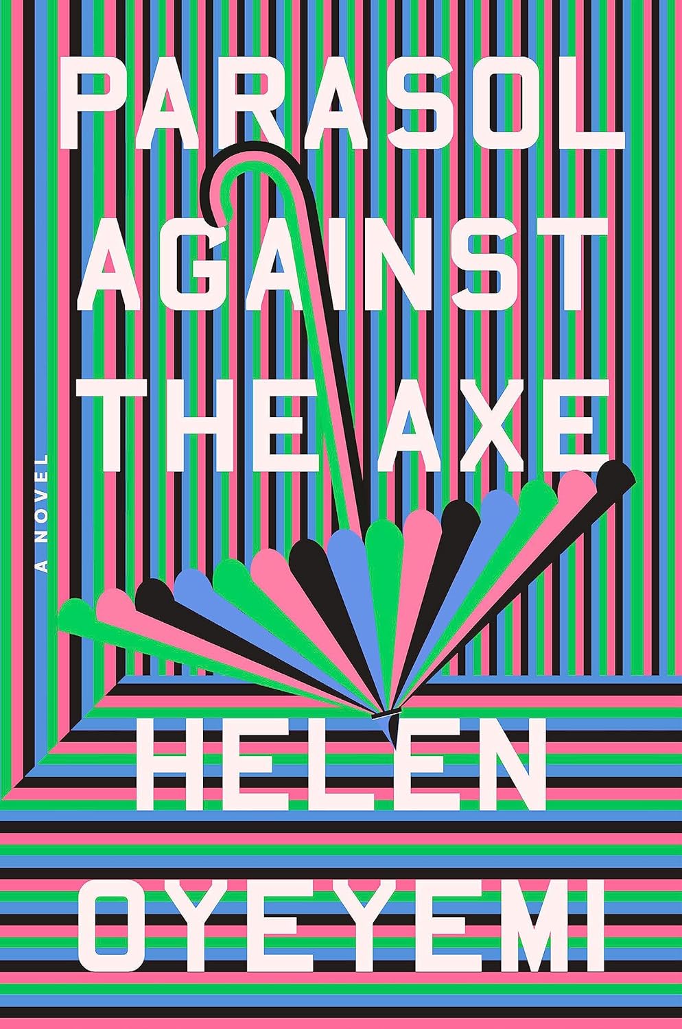
I’m drawn to optical art like a bowerbird to blue, so there’s no denying this one for me. Ignore what I said earlier about theater kid energy, this cover is pure sensory overload and I can’t get enough of it. This feels like the perfect analog to the kaleidoscopic premise and how about that color palette?!
–Jason Arias
I stared at this cover for way too long. Such a treat, especially in person.
–Eli Mock
Every time I see this cover it catches my eye. Great use of color.
–Stephanie Ross
This design is a striking departure from the author’s other books, and is unlike any other cover I saw this year. The optical illusion, color palette, and stark geometry all merge in a way that is strangely, surprisingly likeable.
–Beth Steidle
Whimsical, wavy, and wonderful.
–Sarah Schulte
I love a brown cover, this reminds me of a dream.
–Anna Morrison
Is this what happens when you overdose on the absinthe with the convent at the afters?
–Erik Carter
Besides being a huge fan of medieval drawings, I love the playfulness of the interaction between type and figure here, and the unexpected bright green of the background.
–Natalia Olbinski
The perfect pairing of old and new; seamless integration of type and image. Jon manages to translate medieval type and imagery into contemporary art.
–Alison Forner
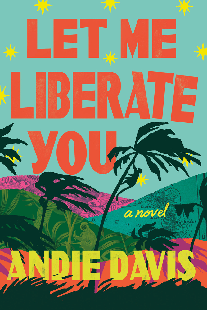
I have no idea what this book is about, but I wanna read it because the cover looks so damn fun! That sausage pink + acidic green combo makes it even more intriguing.
–June Park
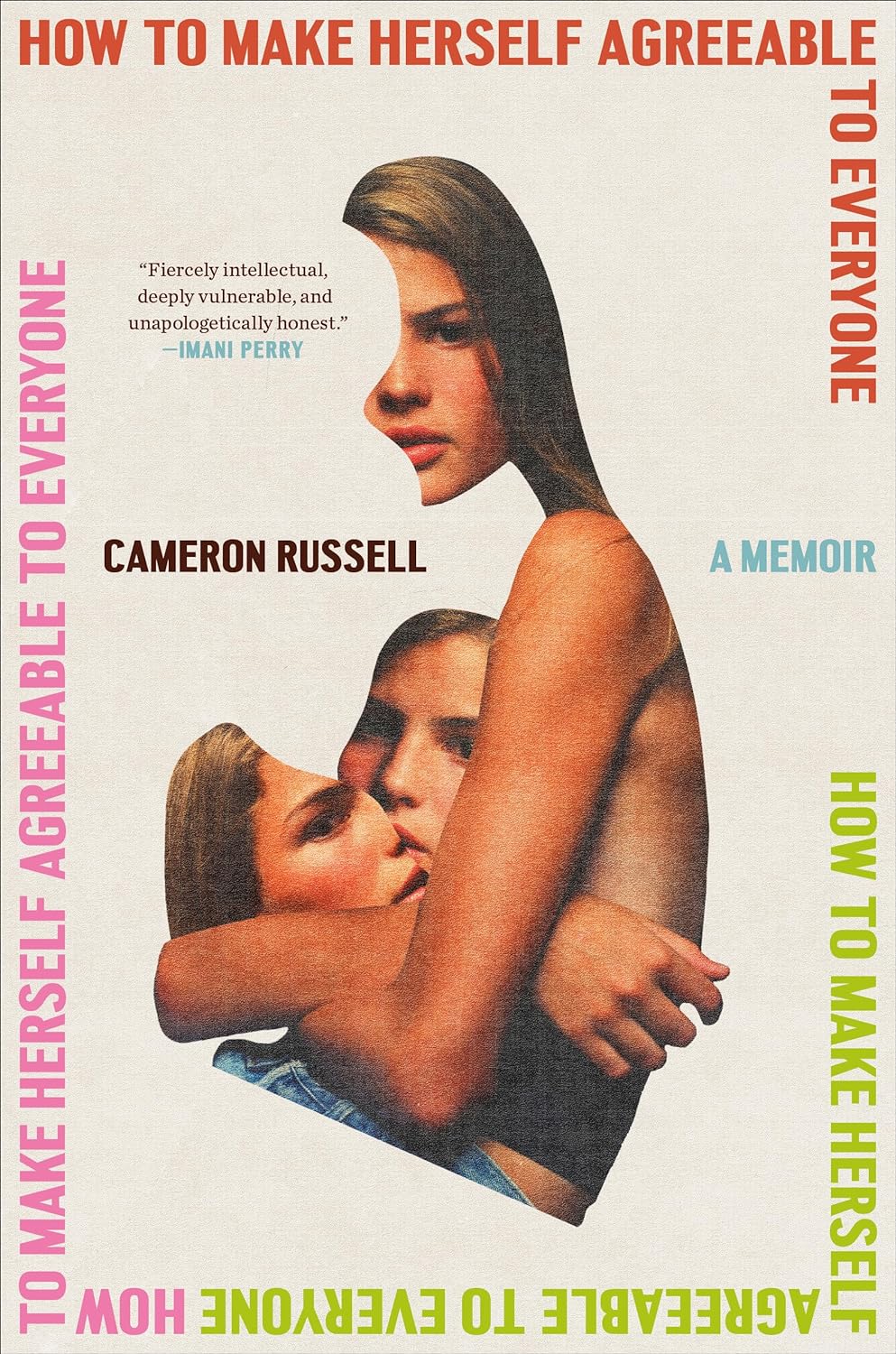
Great design and great use of collage. This cover has an intimacy to it that feels fierce and vulnerable.
–Kelly Winton
Great elements all around. I especially love how the title rephrases depending on how it’s broken.
–Lauren Harms
Collage has always presented an unfamiliar organic-ness to me. The combination of organic and order is great.
–Math Monahan

–Zoe Norvell
Left no crumbs! Every inch thoughtfully designed, fun, action packed, yet still so clean and balanced.
–Janet Hansen
The movement of the type alongside the collage is excellent.
–Alicia Tatone
Quiet and at the same time audibly hissing with barely contained rage.
–Matt Chase
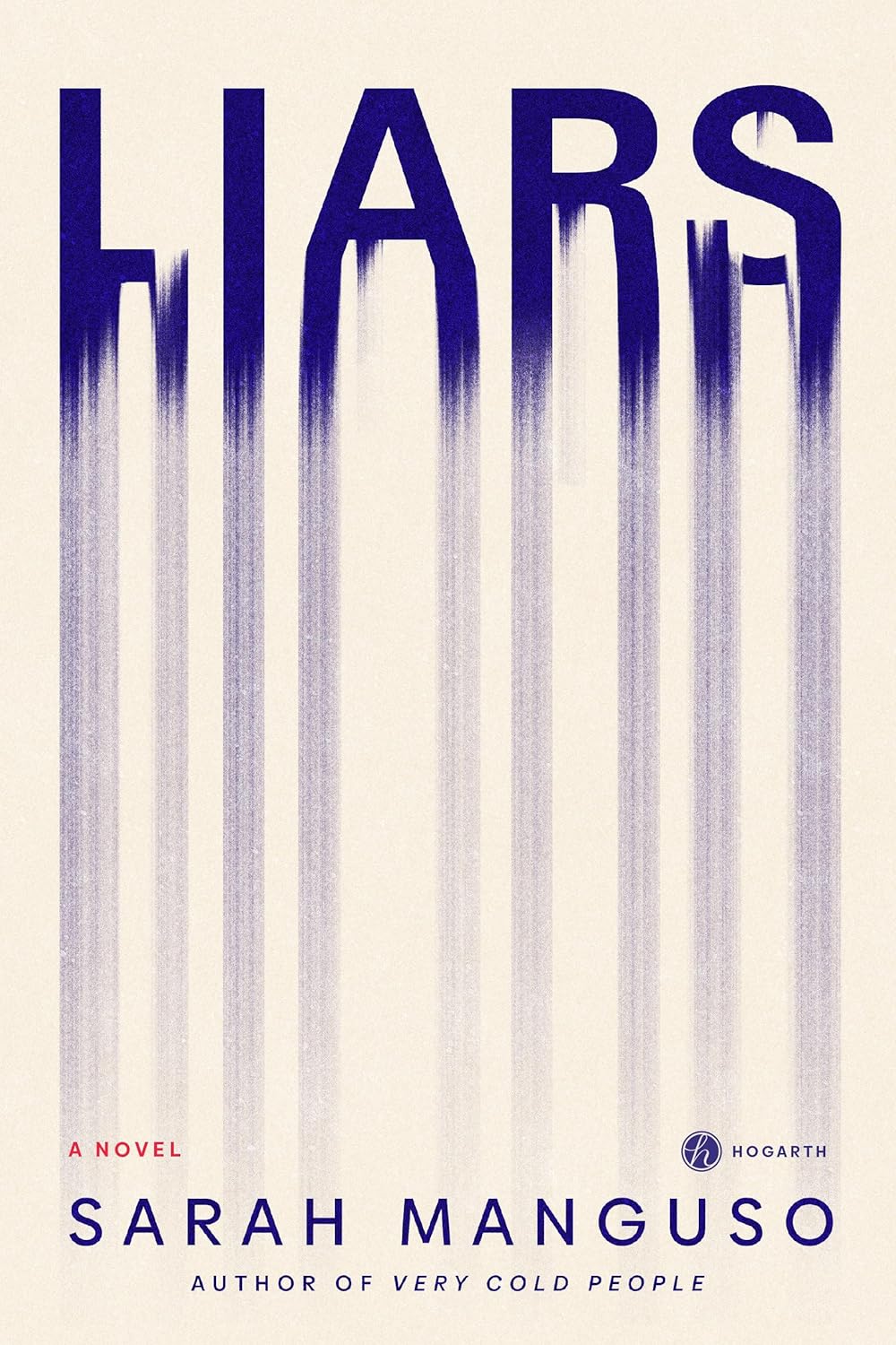
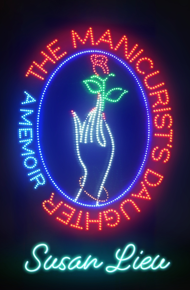
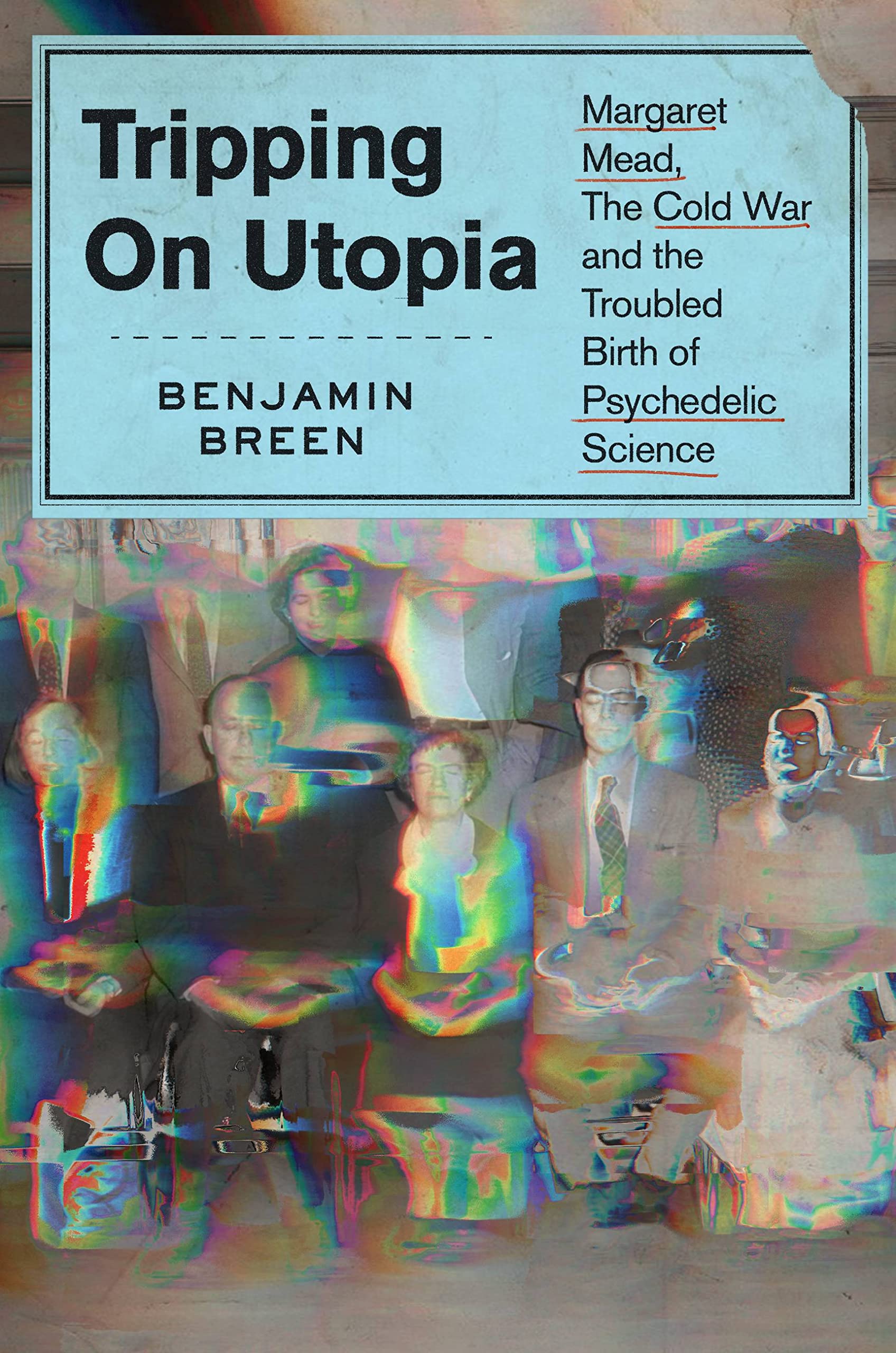
I bought this book based on the title and my expertise and experience with the book’s subject, but after I had the book in my hands, my feelings changed. The cover is formidable, but also the fade is everything. It could be the exhaustion of it all, or just the way liars disappear in plain sight, or how we just let them fade away so we can live. I now keep the book face out on the self in my home because the cover.
–Robin Bilardello
Spot-on type design for Unreliable Narrator / Nature of Stories Itself.
–Mark Abrams
–Grace Han
What a singular thing of beauty. I can’t remember the last time something so graphic felt so astonishing. The playfulness of the script—chef’s kiss!
–Linda Huang
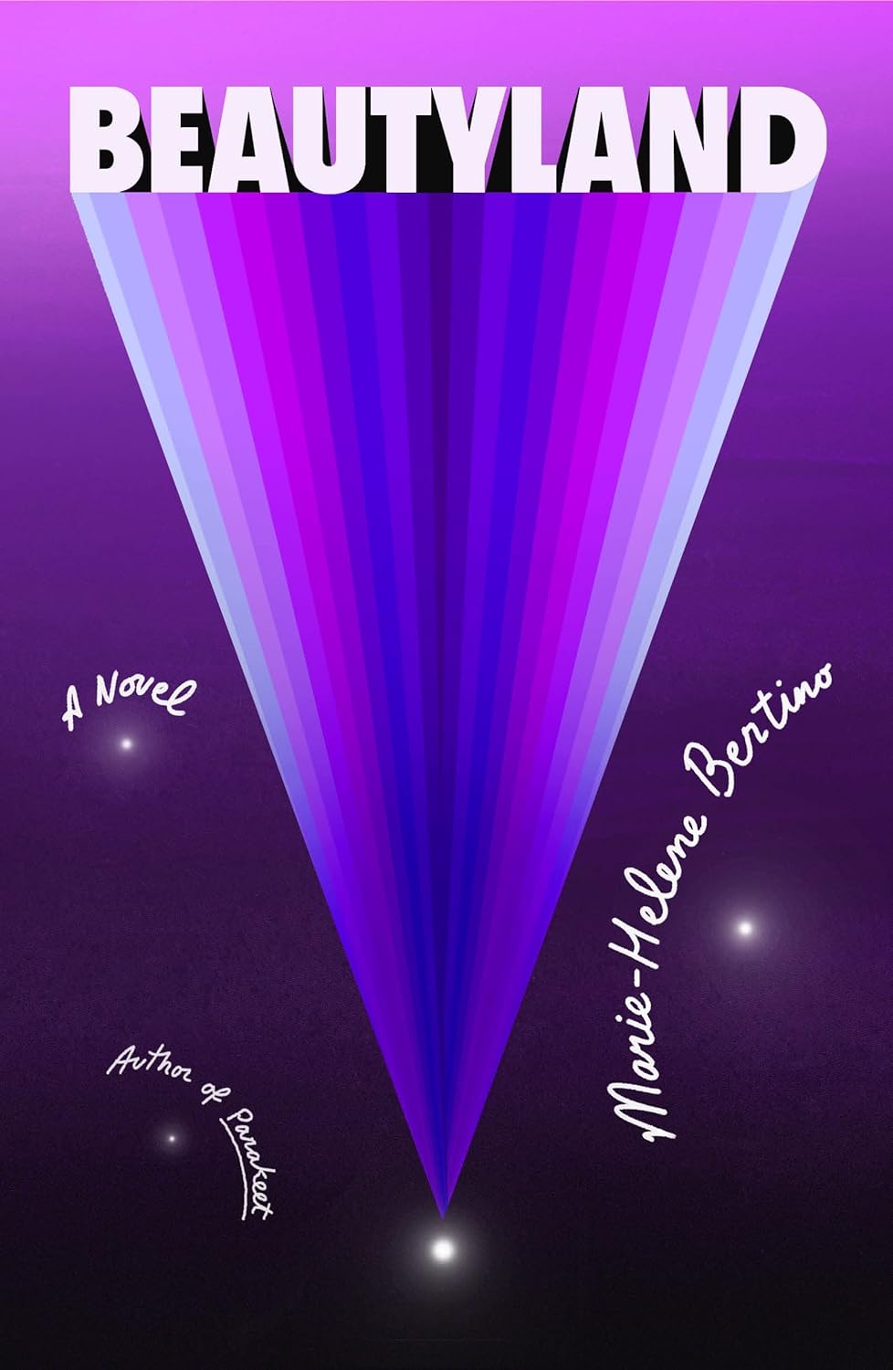
I’m currently reading Beautyland, and I keep flipping back to the cover to look at the title beaming outwards from that tiny point of light in the void—it deepens in meaning with each turn of the page.
–Devin Grosz

A design that manages to reference the title in the most unexpected way possible. Also the green background and red nails—electric!
–Alison Forner
So glad I looked at this week’s releases to spot this one to include! So effective and done confidently. The pared back simplicity works excellently at the blessed thumbnail. And then up close, I’m further intrigued—is it a mannequin? Must read more!
–Rachel Ake
Incredibly smart and clever. Love everything about this.
–James Iacobelli
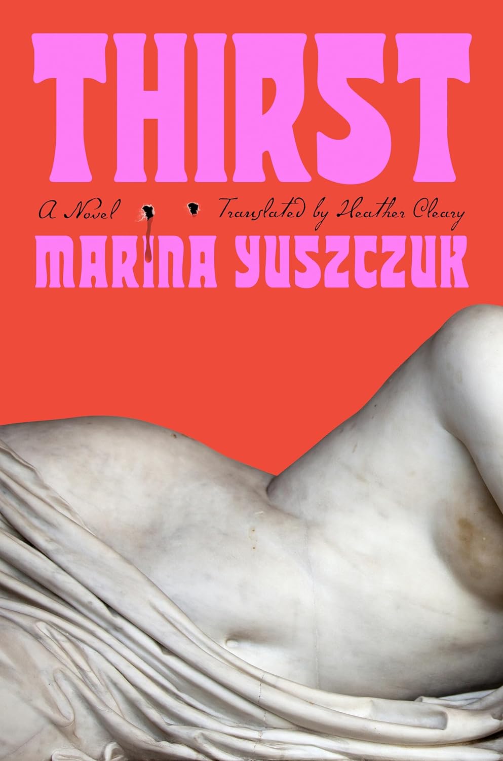
I love the composition here. The combination of the marble statue against the bright red and pink. The cheeky bite mark. A little scary, a little sexy. So much fun.
–Joanne O’Neill
The contrast of textures: marble statue and punctured paper makes my brain happy. Modernity from history. This cover stuck in my mind all year!
–Rachel Ake
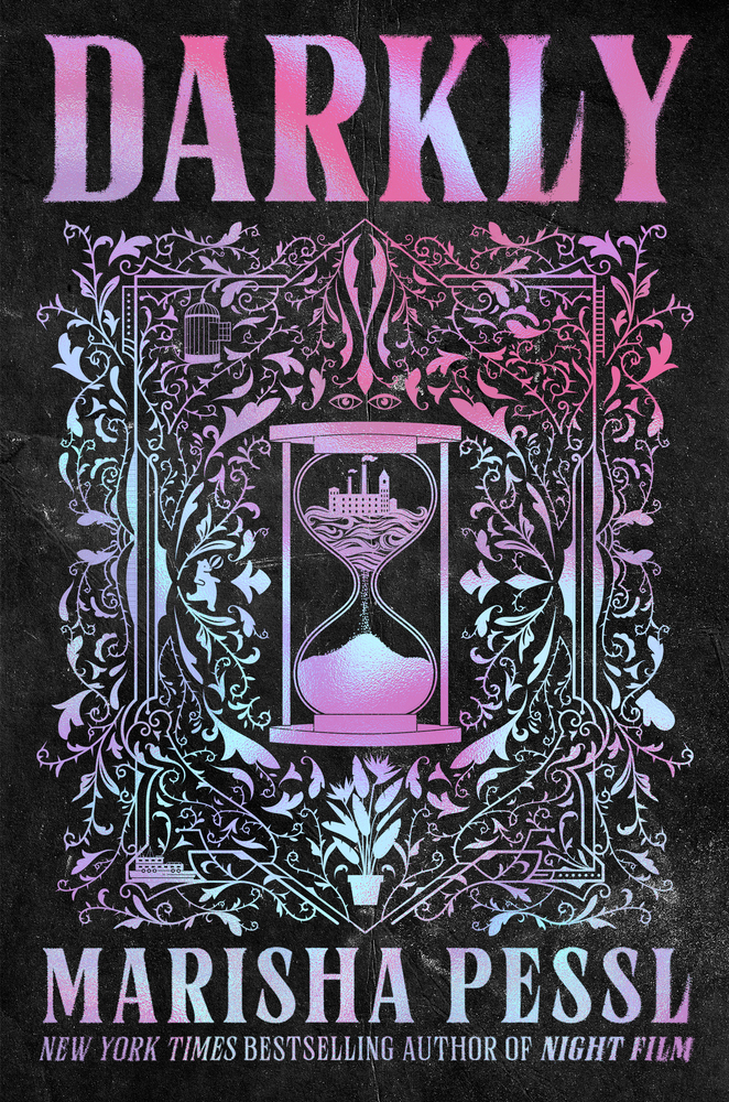
I’m a sucker for this color palette. Fun, and makes me want to know more. I want all vampire novels to look like this!
–Stephanie Ross
–Grace Han
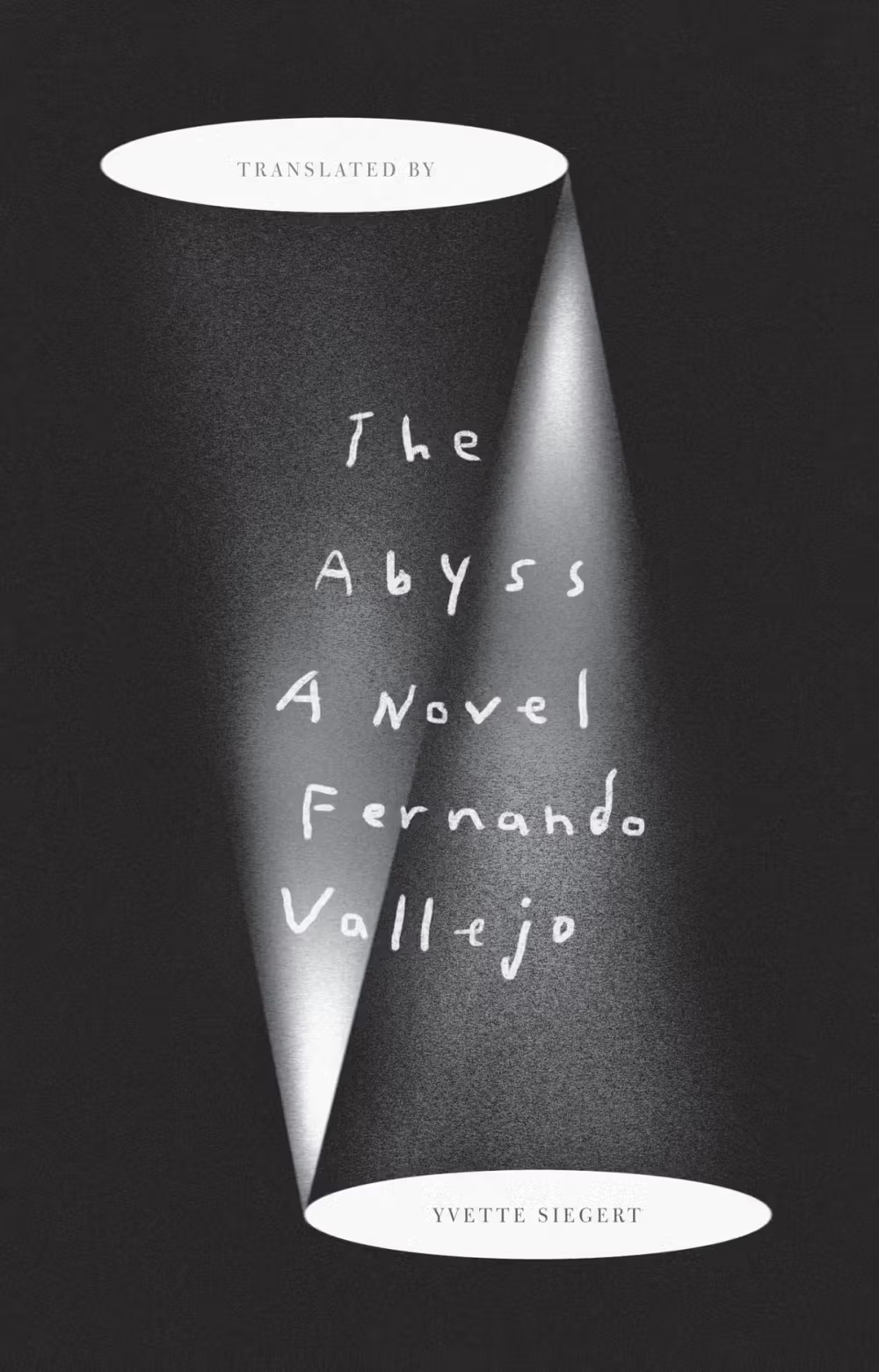
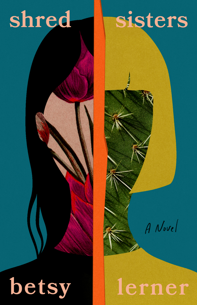
Everything here clicks for me (and love the split translation copy).
–Stephen Brayda
Feels like a haunting question. So beautifully and simply done.
–Kate Sinclair
Every time I see it, I’m mesmerized by the figure (from a photo by Isabelle Wenzel). Weird, beautiful, and set against the most perfect background color.
–Joanne O’Neill
Jaya knows how to put emotion into a book cover one million ways. Iconic photograph + great color.
–Janet Hansen
Such a striking image—I love this bizarre posture.
–Lauren Peters-Collaer

You could spend hours investigating this cover, it reveals so much each time I see it. The imperfections are perfect and I love the frames that aren’t framing anything.
–Jack Smyth
It takes a true expert in color to incorporate so many hues at once while still maintaining readable typography
–Zoe Norvell
Beautifully-executed, vibrant collage. I just love looking at it.
–Luke Bird

This made me smile when I saw it, so clever!
–Holly Ovenden
What is more delightful than a book inspiring its own playful objectification in this way?
–Jason Arias
I love the elegance and simplicity of this approach. The cover works on its own terms, but also becomes a house when you start reading it. Brilliant!
–Kate Sinclair
Love the tactility and personality of this cover. It almost feels like a real piece of graffiti you’d see on a random block as you’re heading towards the subway.
–Alicia Tatone
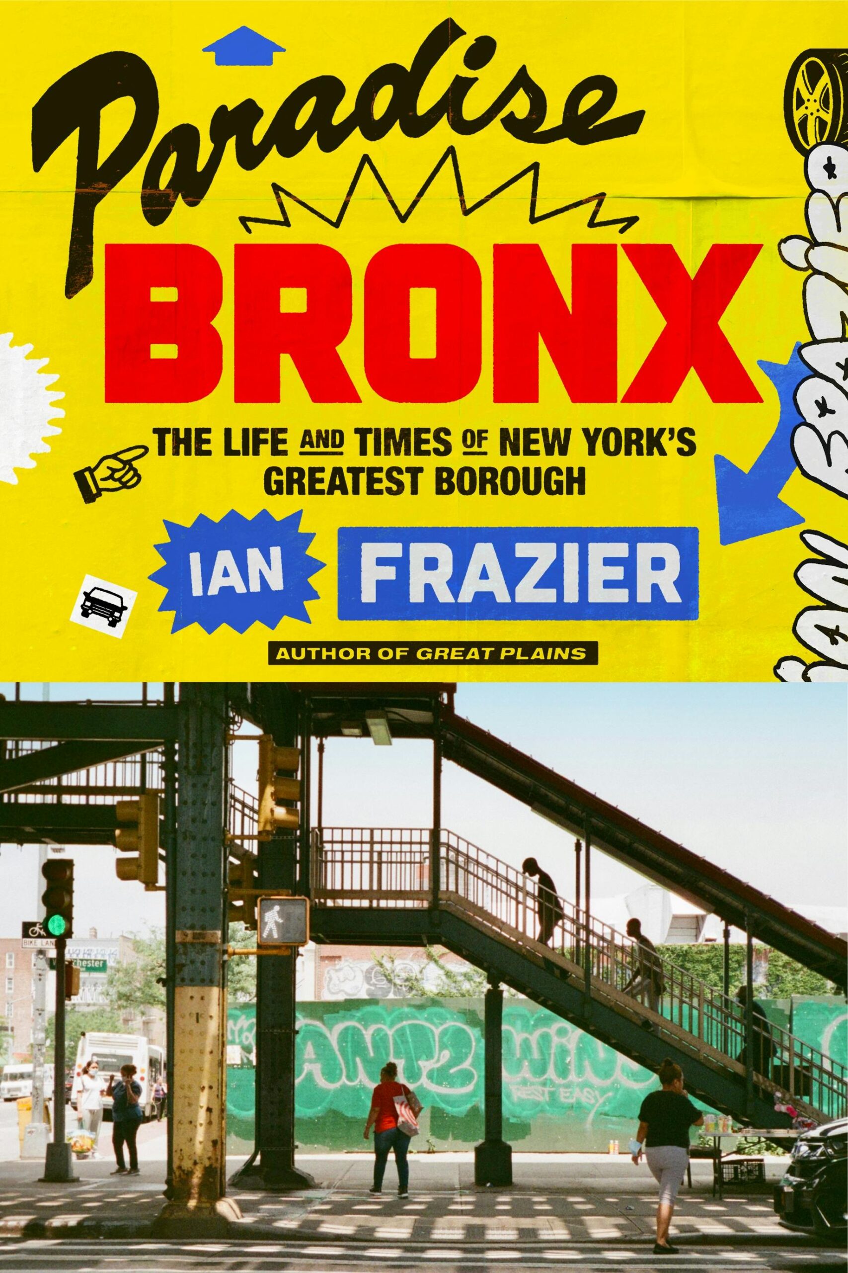
Thomas has such a special talent for making nonfiction covers just as exciting as fiction covers, if not more. I love this maximalist NY moment jam-packed with character.
–June Park
Stunning typography. It’s brilliant.
–James Iacobelli
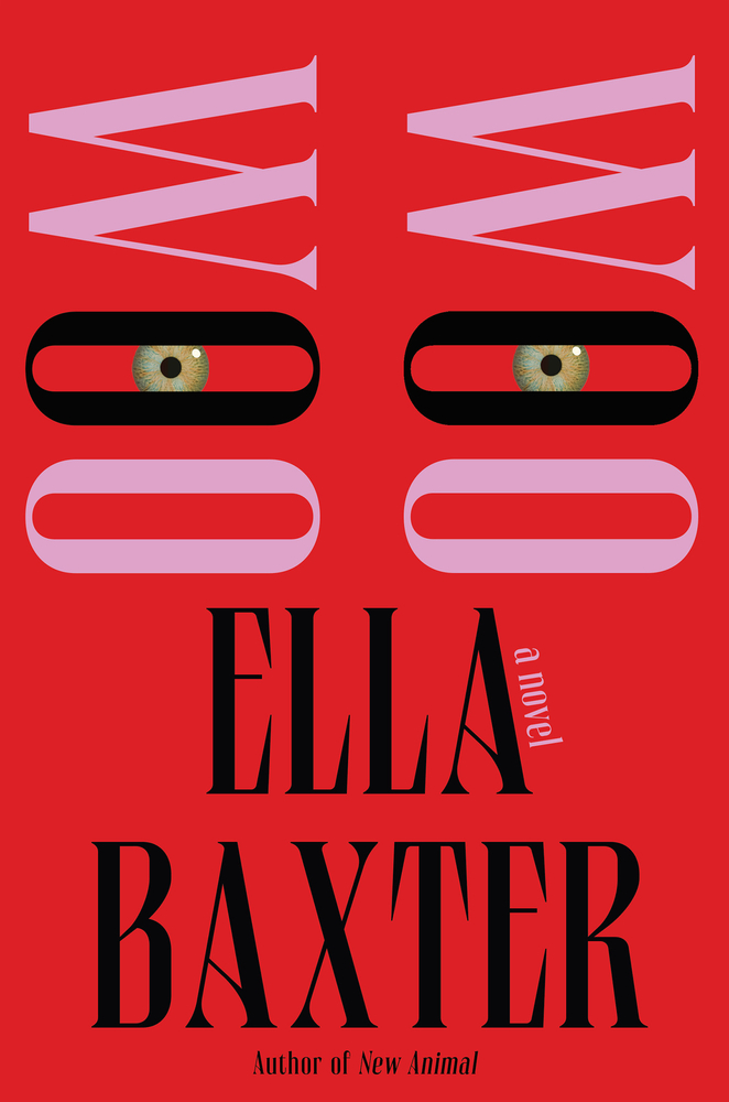
I love those jarring green eyes paired with the smart and sexy font and color choices. Startling in the best way & I can’t look away…!
–June Park

This one leaves me speechless.
–Joanne O’Neill
Embodies experimental German psychedelic rock beautifully.
–David Litman
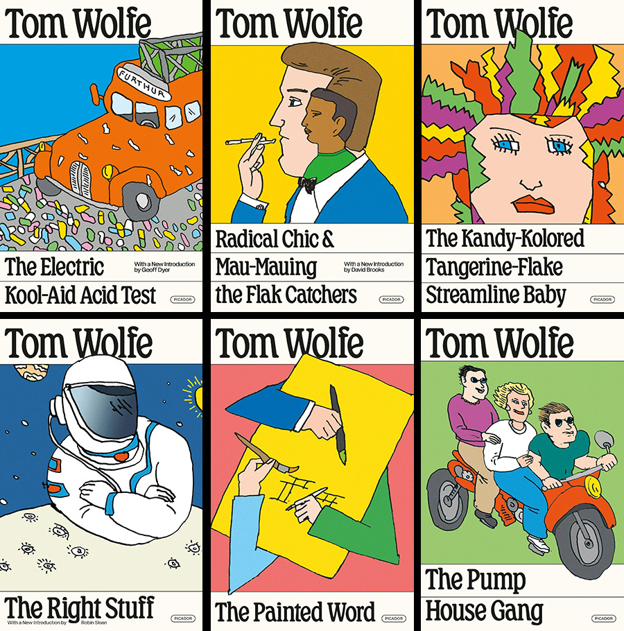
Of course the legendary Seymour Chwast was the perfect illustrator for these reissues, but I’d like to also call attention to Alex’s design system–from the wry typeface to the clean, horizontal rules. They feel fresh and frame the illustrations into collectable classics.
–Linda Huang
When a redesigned backlist makes you want to buy them all, the design is definitely working.
–Jenny Carrow
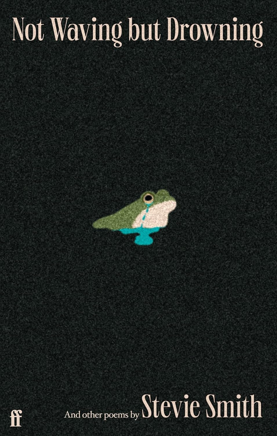
So cute, so simple, so pure. I’m immediately drawn in and must know every emotion this little frog is feeling.
–Math Monahan
So sweet, so sad. Darkly funny, much like Stevie’s poetry.
–Joanne O’Neill
–Beth Steidle
Mesmerizing, but also, how did you get this approved? Asking for a friend.
–Math Monahan
Imagine a grubby corner bookshop with a rack for local zines—these would fit in fairly well, I wish to acquire them all.
–Mark Abrams
Perfect oddballs! I love them!
–Alicia Tatone
I love how the pulp board background transforms into sand and the shadow suddenly comes to life.
–Jamie Keenan
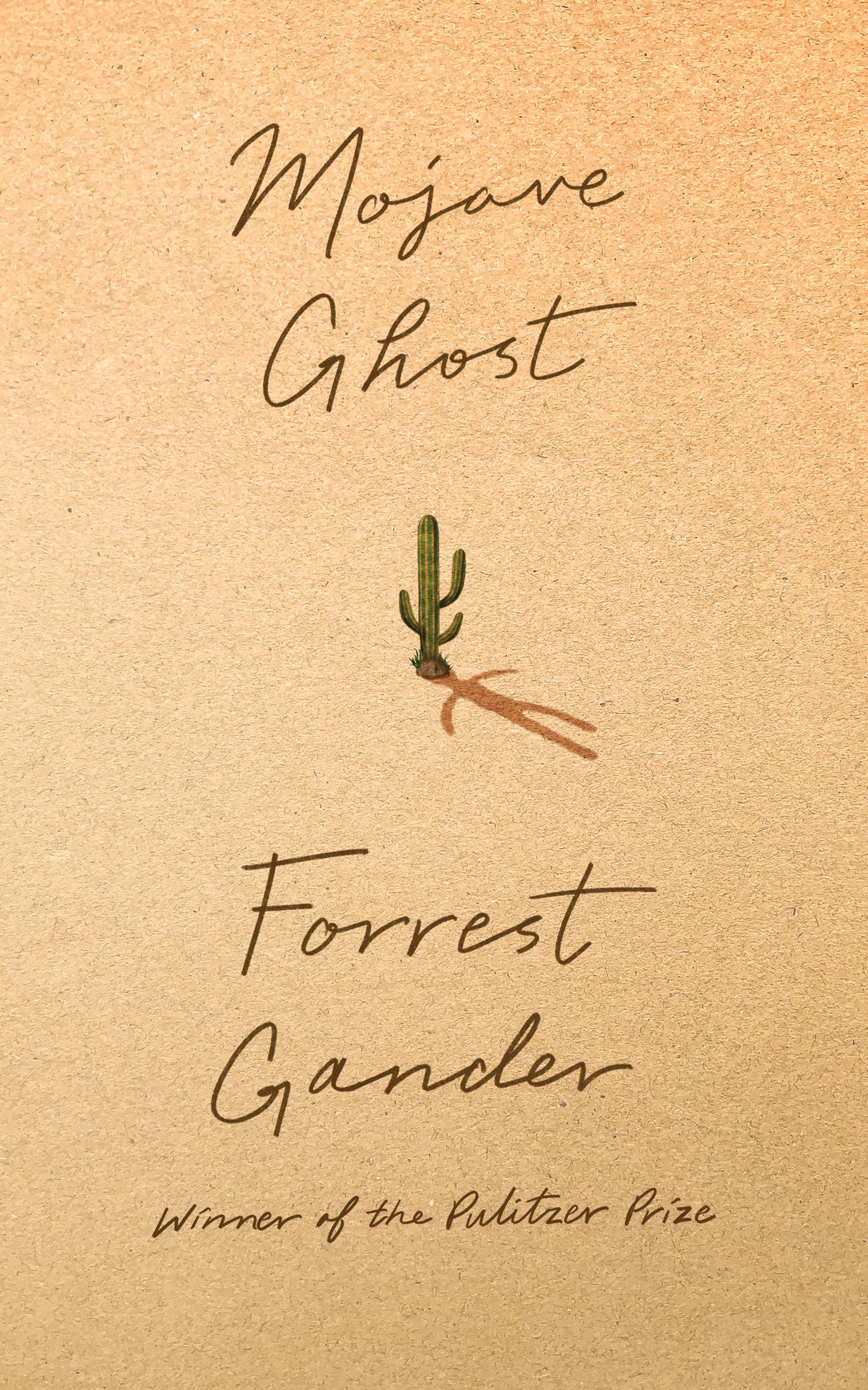
So much can be said with so little when the idea is smart. Thank you to the designer for the beauty and simplicity of Mojave Ghost by Forrest Gander. The quiet wit of this cover sings to me.
–Charlotte Strick

Uncanny and disturbing in the very best way.
–Devin Grosz
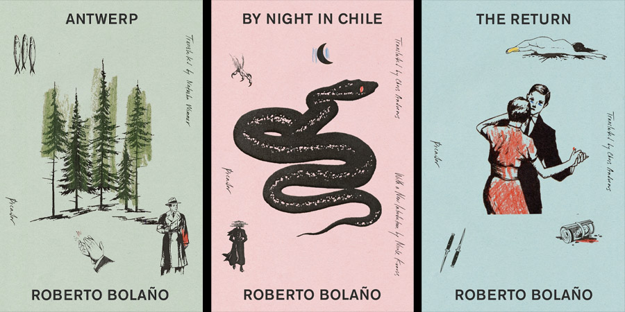
The cover for Model Home by Rivers Solomon froze me in my airport-bookstore-browsing tracks. Was it the flood of toxic swamp-green overprinted with black? Was it the eerie Alice in Wonderland-sized eye passively peering through the second story window? Or simply the font choice: a 1980s dark alley mashup of medieval Uncial x Victorian Copperplate . . . those truncated capital “S”s slithering up through the suburban lawn? In a word, YES!
–Charlotte Strick
These images are great together and the reduced palette really helps relate them to one another. So minimal and yet so suggestive.
–Vivian Lopez Rowe
This cover makes me squirm, in the best possible way.
–Mark Abrams
This cover makes me feel a beloved nostalgia for quieter, more classic designs. In the sea of similarities in cover design we see today, this classic yet modern, smart and intriguing portal is a breath of fresh air. It is bold in its quietness and suits the subject perfectly.
–Nicole Caputo
This brings to mind the haunting ending of the movie The Vanishing (the original one, from 1988, please) but in a much, much more cheerful, Pushing Daisies way. Love.
–Mark Abrams
An amazing combination of just the right imperfectly perfect illustration and hand lettering.
–Stephen Brayda
A pitch-perfect encapsulation of the title, in all its deadpan hilarity.
–Devin Grosz
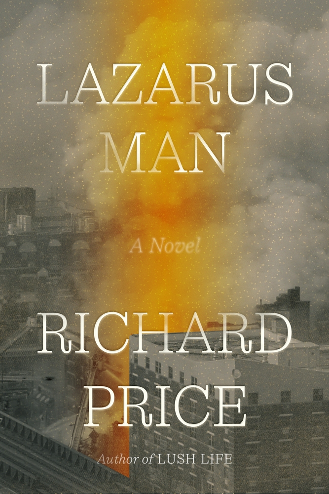
That plume of orange brings this cover to life.
–Eli Mock
Painterly. Classic.
–Emily Mahon
There is an edginess to the melting art as it guides your eye down the cover.
–Kimberly Glyder
This falls squarely into “covers I experience viscerally” territory. It’s almost as if the artwork is melting over the type in real time.
–Alison Forner
Hilarious! Brings me joy.
–Stephanie Ross
This cover could easily have been too silly, but the muted orange, leftward glance, and slightly angry expression create a Goldilocks balance between funny and intriguing.
–Beth Steidle

I loved the vintage vibes of this cover, and what fun fonts!
–Jaya Nicely
It feels nostalgic and contemporary at the same time.
–Grace Han
One of those covers that, after seeing it, you just nod and say “yep, of course” and accept that nothing else could possibly have worked better.
–Matt Chase
Minimal and impactful!
–Grace Han
–Zoe Norvell
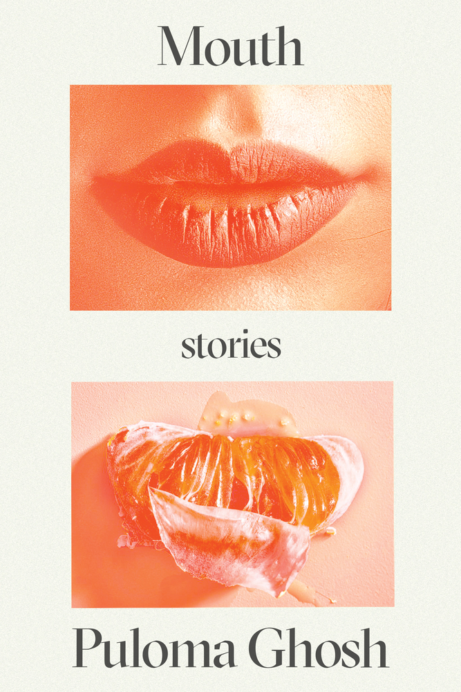
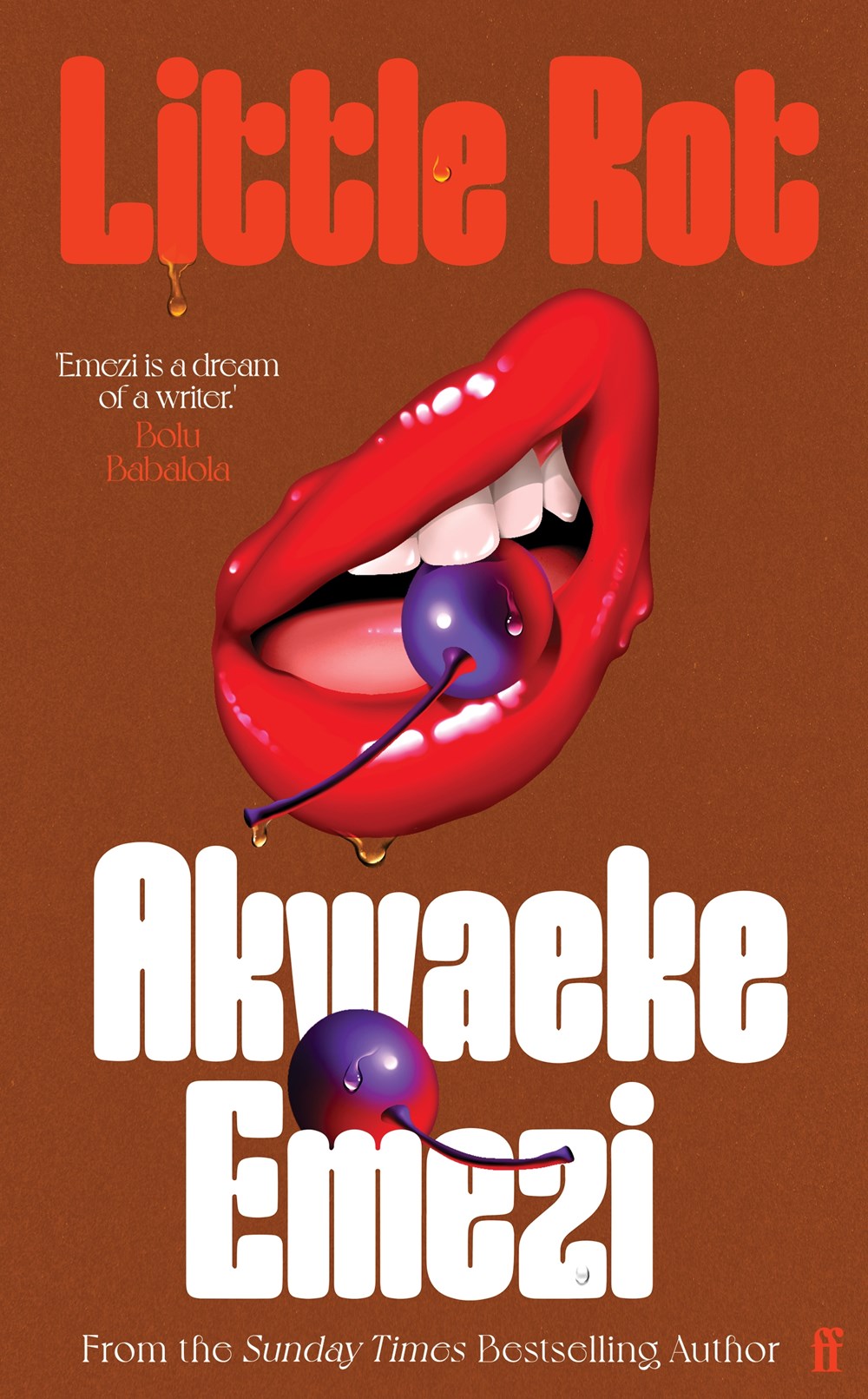
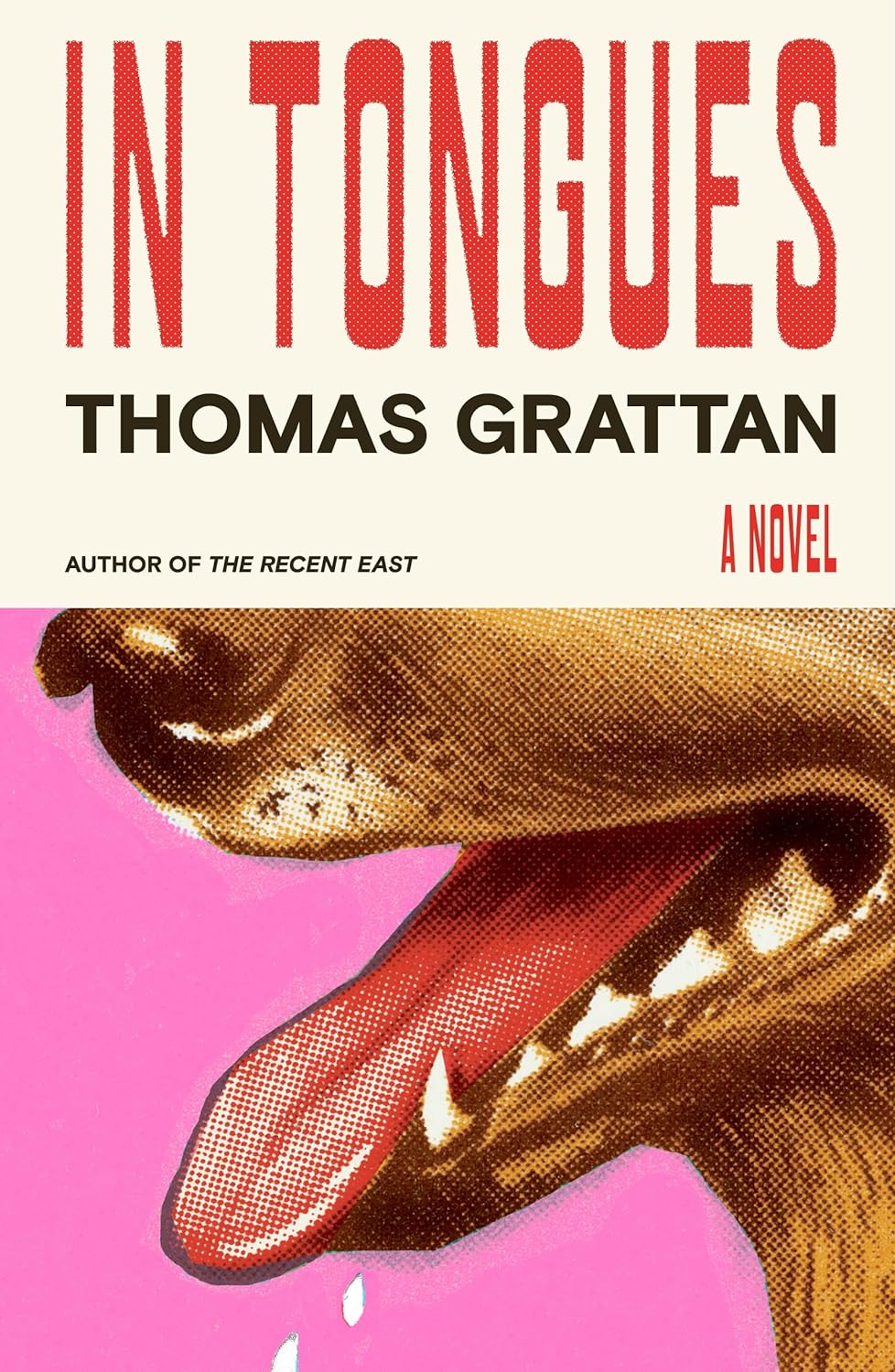
Zoomed-in, gooey mouth AND brown background! The number of times I’ve been told no to each of these things on their own… and combined! Look at this beauty! Don’t you just want to feel it? Could anyone let me know what finish this has? Lol. Kishan strikes again!
–Rachel Ake
–Zoe Norvell
It’s subtle but textured. It’s a cover that is already beautiful when you pick it up but becomes more brilliant as you get to know the story.
–Joan Wong
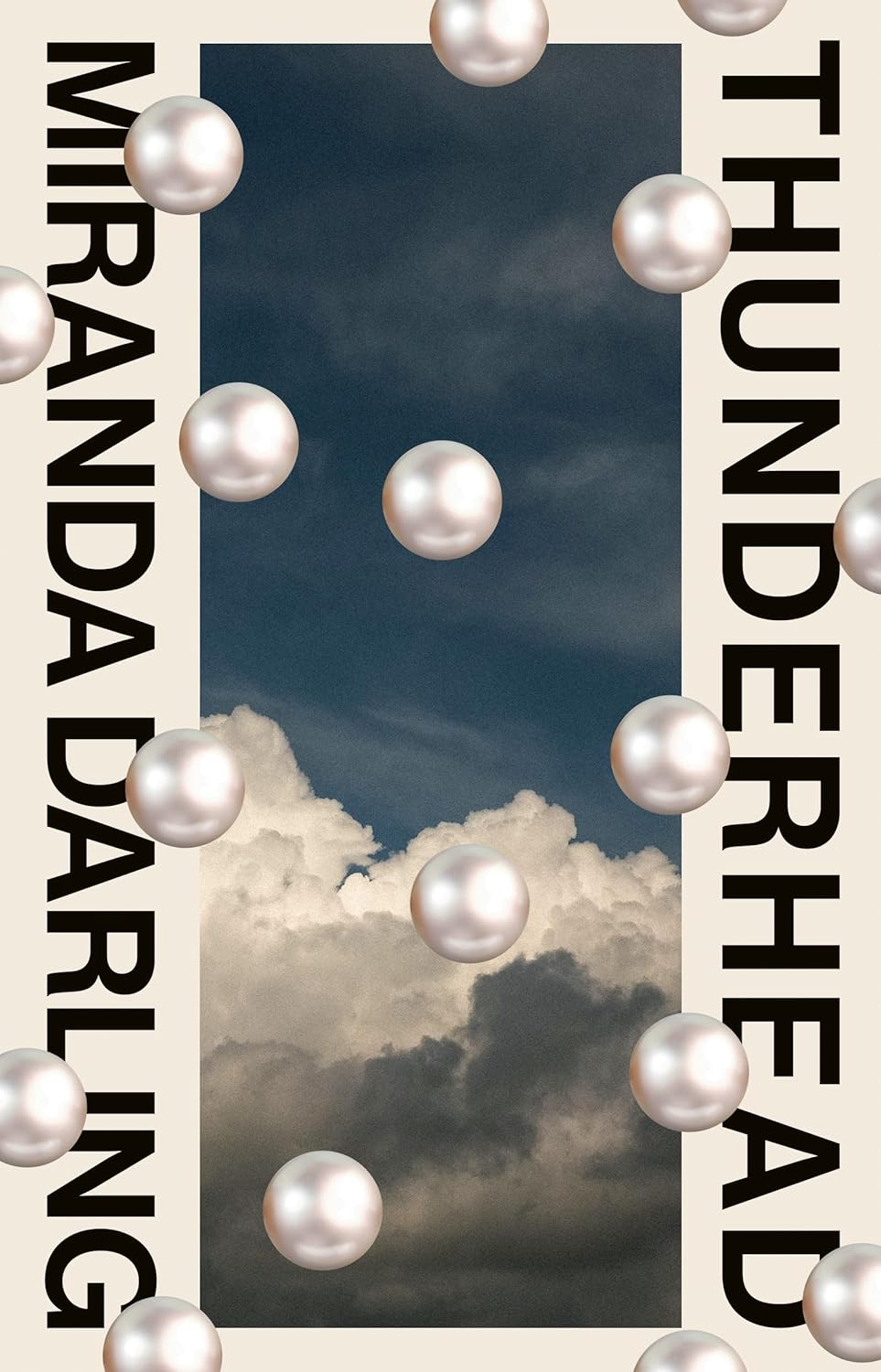
It’s the pearls, they’re floating on a plane between me and the rest of the cover and it is mesmerising.
–Jack Smyth
So beautiful and strange. I don’t know what’s going on, but I want to.
–Lauren Peters-Collaer

A beautifully simple and elegant cover.
–Tom Etherington
There’s something so pleasing about the way that this cover can be viewed from almost any angle, and it still works just as well.
–Luke Bird
Playful, eerie, and also elegant—a perfect combination.
–Sarah Schulte
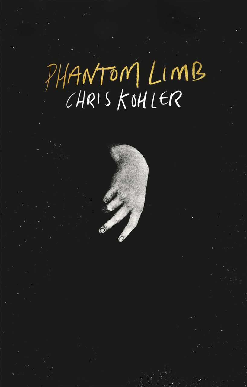
Strange and unexpected. I like the way the body parts look like hovering, unsettling, abstract thoughts.
–Kate Sinclair
This stands out so much in a landscape of large lettered, brightly coloured, shouty book covers. Understated, off-kilter and brilliant.
–Tom Etherington
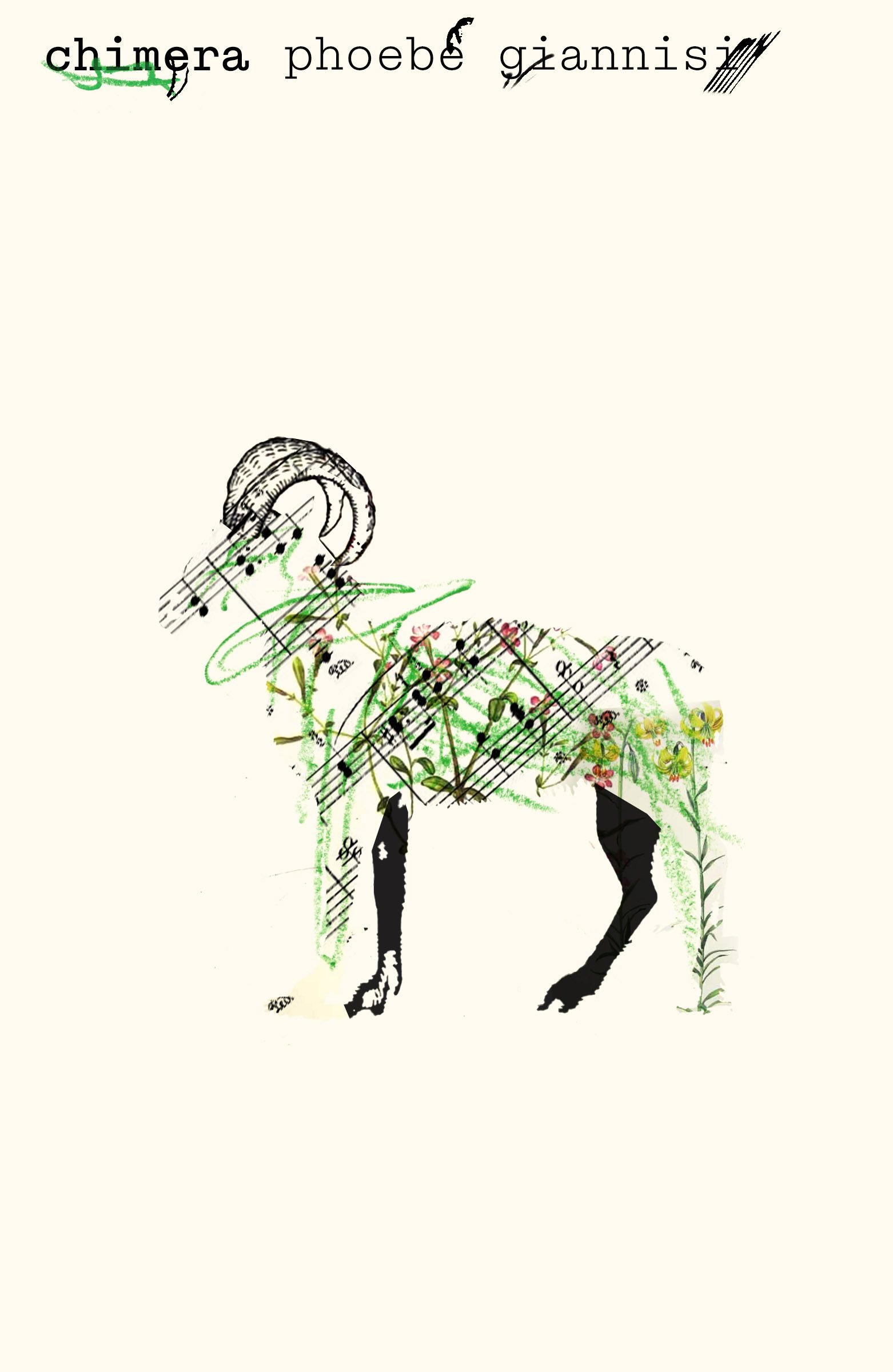
This cover is pure poetry. I’m drawn to the marks, their gesture and placement, and intrigued by the mythology of this lyrical ram.
–Natalia Olbinski
This design creates such a sense of place. A universal place that could be anywhere and offers an entry to the story. You can hear the electricity humming.
–Lauren Harms
THIS book HAD to have THIS design. It’s perfect.
–Zoe Norvell
Love this clever collage, really catches the eye.
–Holly Ovenden
This design has stayed on my mind all year. I find it both timeless and totally fresh.
–Morgan Krehbiel
This cover is going for a mood and absolutely nails it. The tension is palpable and utterly compelling.
–Milan Božić
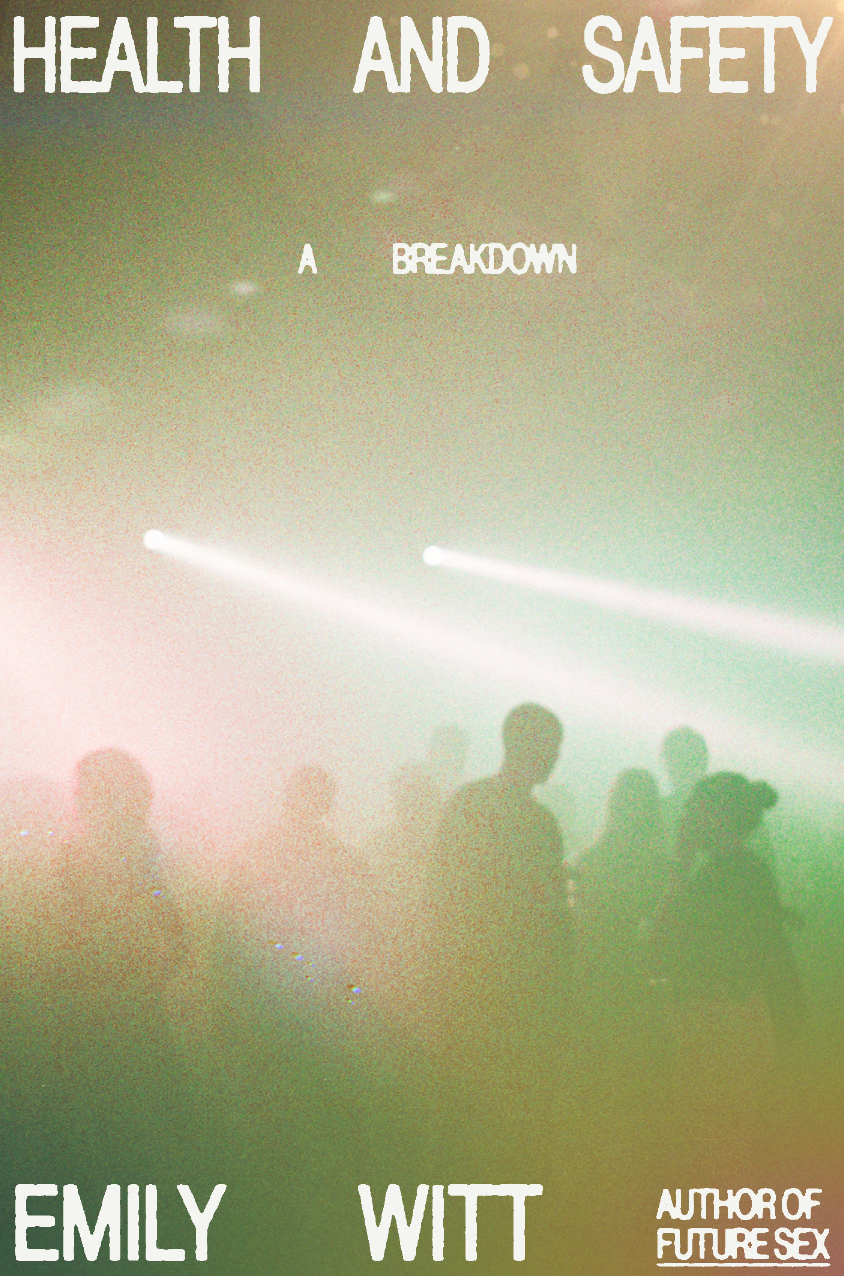
The type makes my eyes work across the cover in a way that echoes a huge semi-full venue, it makes me feel like I’m there.
–Jack Smyth
I want to zoom in twice over.
–Arsh Raziuddin
I may be biased since this cover uses my favorite shade of pink, but Alex’s Merto’s design hit this one right on the head. Loved this cover as soon as I saw it.
–Jaya Nicely
This cover is playful, joyous, and confidently simple. The perforated tabs add a fun tactile element, transforming it into a considered and highly covetable object.
–Kishan Rajani
A delight!
–Holly Ovenden
This cover is so striking (no pun intended). The gradients, the texture, the photo, the typeface. Harmonious. Perfect.
–Joanne O’Neill
This has such a lovely combination of the brutal and the beautiful.
–Jamie Keenan
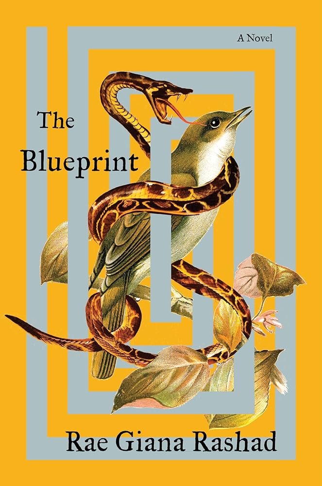
The weaving of the snake and bird between the maze is so powerful, and the tension between the snake’s tongue and the bird’s eye is a satisfying detail. I love the unique color palette as well.
–Joanne O’Neill
Full disclosure: Robin and I work in the same art department, so I had the privilege to watch this cover evolve into the brilliance that it ended up as. Nonetheless, it’s a magical example of a perfect collage in an unexpected layout. The silver labyrinth works best IRL.
–Milan Božić
One of those covers you feel rather than see; as captivating as the poems inside.
–Morgan Krehbiel
A beautiful cover, full of emotion.
–Eli Mock

Of course she did!
–Arsh Raziuddin
The typographic gymnastics and simple use of color are incredible.
–Eli Mock
–Grace Han
This is such a strange colour scheme, but it works so well and there’s something about those two brown dots lining up with the eyes that grabs me.
–Jamie Keenan
A more perfect painting for this book doesn’t exist. The attitude the painting exudes, the cropping, the nods to renaissance painting but with Black subjects. It’s just perfect.
–Jenni Surasky
The cropping of the painting and handlettered type—the emotional pull of this jacket is undeniable.
–Alison Forner
Give me a dog on a cover any day! Kate is a master at using retro imagery with unique type. See also her cover for Layman’s Report. Also love the US cover (by Rodrigo Corral). [ed note: both also on this list!] After seeing the two, I knew I NEEDED to read this book and what more is this job?
–Rachel Ake
Missing Faces seems to be a thing at the moment, one of those bursts of design weather under no one’s control, but this one still deeply tickles my fancy.
–Mark Abrams
Playfully medieval with gorgeous typography.
–Eli Mock
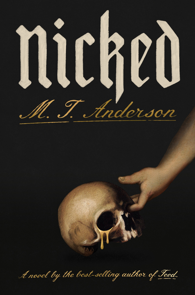
My role at Bindery Books has thrust me into the world of fantasy and noir fiction. It’s thrilling to turn the fantasy cover trope on its skull (!) as the designer of Nicked has. I applaud the simplicity of the thief’s brazen gesture, gripping the fearful half skull through its non-weeping socket; it illustrates M. T. Anderson’s title artfully.
–Charlotte Strick
Brilliant, striking. Serene despite the violence of the knife wound. I can’t imagine a more perfect cover for this book.
–Natalia Olbinski
Such a fitting solution that it feels impossible to imagine this book having any other cover.
–Alicia Tatone
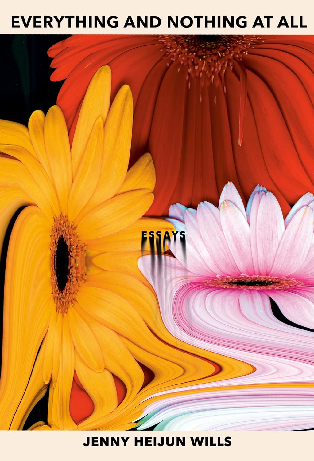
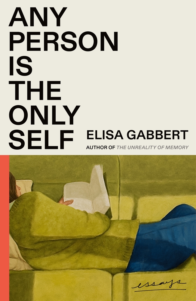
So weird and yet so beautifully balanced. “Essays” is the star of the show.
–Luke Bird
This somehow combines joy and uneasiness, and in such a beautiful way!
–Math Monahan

Big and bleak, just like László!
–Erik Carter
Great marriage (couldn’t resist…) of illustration and typography.
–Jenny Carrow

The tension between the angular typography and the lush painting, the fantastic use of negative space, and the mystery of what lies outside the frame—this one is a stunner.
–Devin Grosz

So smart.
–Grace Han

Eleanor’s illustration integrates and breaks through the classic series design format adding dimension, lushness and a provocative peek into “a world where newly-forged communities and reverence for nature rise from the ashes of a pandemic-ravaged society” in this climate action fiction. Perfect in concept and execution.
–Nicole Caputo
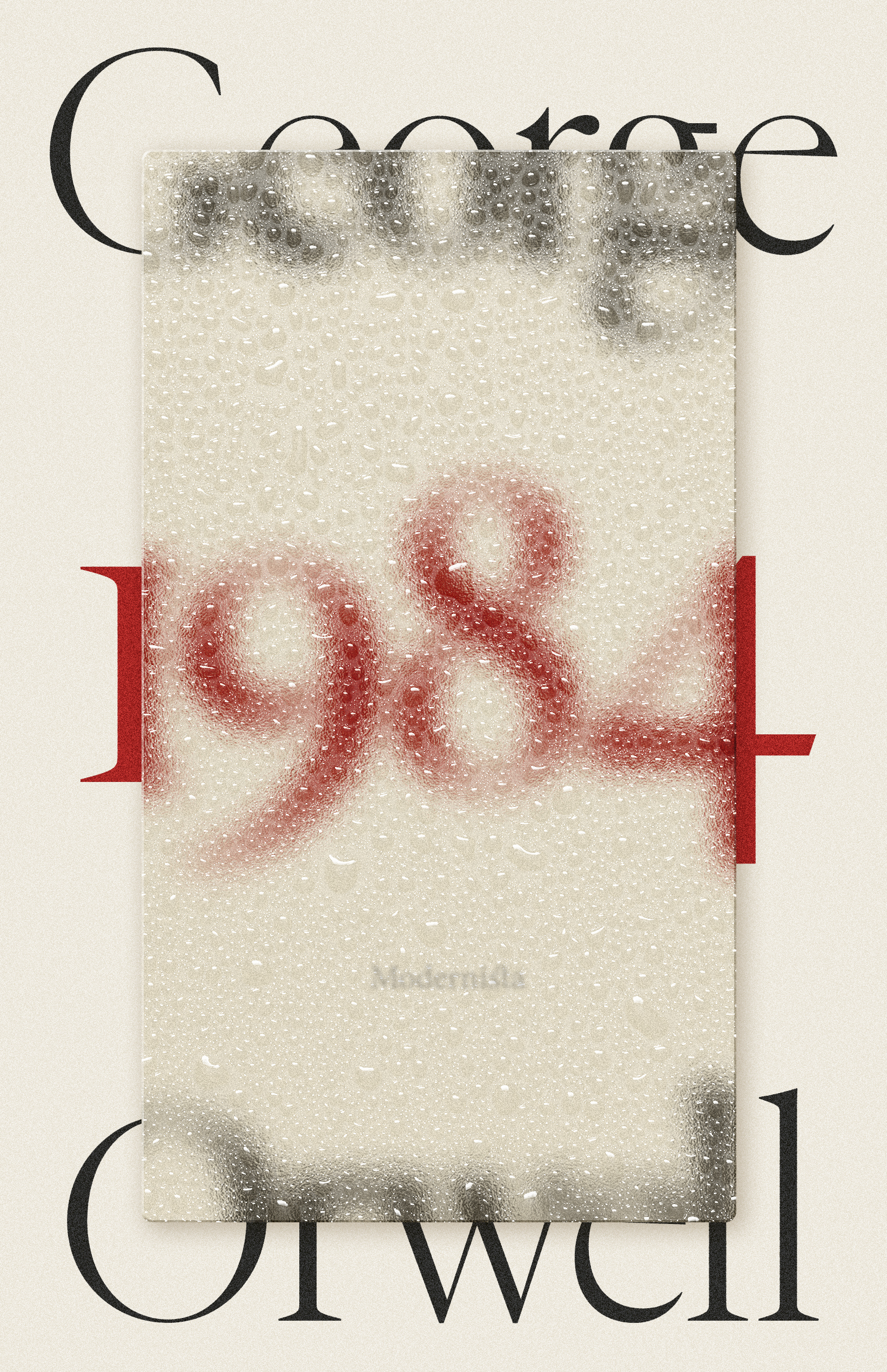
Everything Rasmus Pettersson does is brilliant. This Swedish edition of 1984 is not only gorgeous but manages to resist the usual Orwellian tropes.
–Alban Fischer
Perfect.
–Lauren Peters-Collaer
That author type is so, so good. Every element is just really creepy. In a good way.
–Luke Bird
So simple but so impactful. I love how the illustration feels at once otherworldly and familiar.
–Dana Li
Brilliant! Chef’s kiss! Immediately understood what might be under this cover and so beautiful. That tension between the hot pink splotches and the sparkle has me hooked.
–Rachel Ake

I remember the ‘90s Satanic Panic from my adolescence, and this cover is a fantastic modern spin on that wild cultural flashpoint. I especially like the type treatment—the edges of the type vibrate, as if they had been repeatedly run through a Xerox machine.
–Devin Grosz
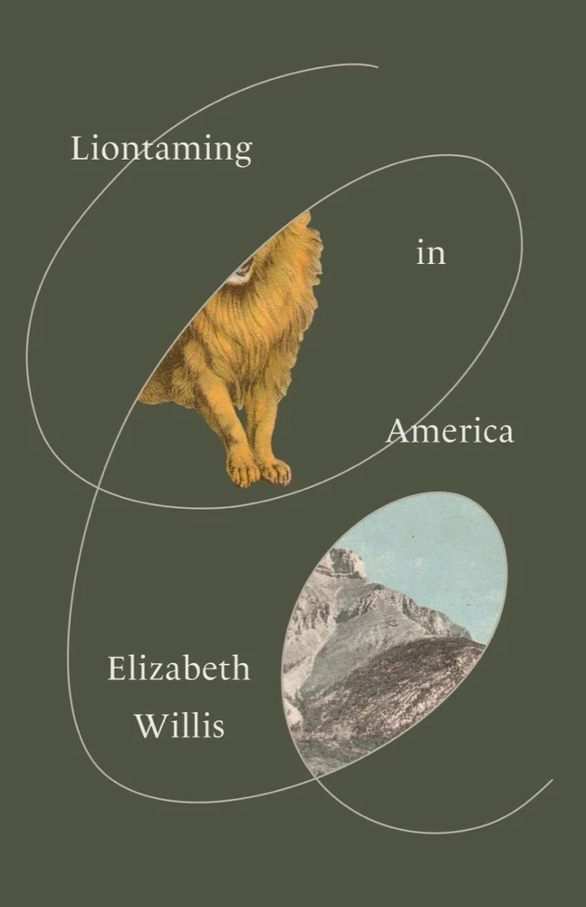
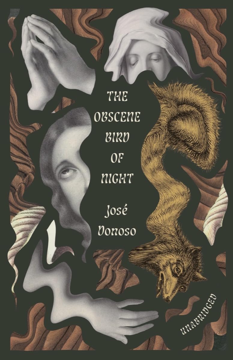
I have to limit myself to one Joan Wong every year, so I’m choosing this one, though I could easily pick The Obscene Bird of Night for the melty dreamworld nightmare goodness. Anyway. The lion, perched, folded into the loop. The mountain, nestled, in another. I’m in.
–Mark Abrams

This design is both extravagant and stunningly simple. A dessert itself.
–Morgan Krehbiel
Pure energy exploding craziness but at the same time super controlled and refined.
–Ben Denzer
Typographic perfection.
–Mark Abrams

I ordered this book immediately after seeing the cover Jack posted. Woah it’s so good, it feels broken.
–Robin Bilardello
I’m a sucker for a painting on a cover and this beautiful, almost monochrome piece by Jess Allen works so wonderfully with June Park’s minimal design. Adding that red stripe is also genius.
–Jaya Nicely
This design reminds me of looking out of an airplane window, but instead of seeing something distant and expected, it is too close and too monstrous. The claustrophobia and minimalism work perfectly in concert.
–Beth Steidle

It has a 1920s elegance that is timeless but is also ethereal in a way that is very contemporary.
–Vivian Lopez Rowe
Suzanne is a master of using the perfect illustrator for a cover.
–Anna Morrison

The colors caught my eye immediately. A great twist on two genre styles, hitting the perfect tone. Suspenseful but bright and contemporary.
–Lauren Harms
Delicious.
–Mark Abrams
Love the delicate details in the windows.
–Jenny Carrow

The collage of the author’s artwork lends an element of the archival while the small scrap of paper itself is suggestive of a tablet. Beautifully chaotic and considered.
–Alban Fischer
The feeling is that of a whole universe of competing sentiments—fragility/confidence, hope/reality, motherhood/childhood—forced into some kind of haphazard, contingent resolution. There’s a terrific sophistication at work here.
–Matt Chase
I admire Sarah Schulte’s designs. This cover is a lovely example of her artistry and understated elegance.
–Kelly Winton
I love how unapologetically fun this cover is. The design absolutely sits within the crime genre market but done so in a way we’ve not seen before. I think a part of why this book has done so well is undeniably in credit to this gorgeous cover.
–Kishan Rajani
Quietly beautiful and haunting. I love the tension created by the placement of the title.
–Sarah Schulte
There’s nothing like it out there. Love, love, love.
–Vivian Lopez Rowe

Beauford Delaney’s portrait of Baldwin sings.
–Mark Abrams
I love the choice to arch the type and sharp serif!
–Cassie Gonzales Vu
This is my most favorite cover of the year. The cover looks like actual action figure packaging, and the special effects are just the cherry on top.
–Laywan Kwan
A little bonkers and completely original.
–Jenny Carrow
Just incredibly stylish and tasteful.
–Kate Sinclair
This cover is a masterpiece of simplicity. Its striking art eliminates the need for a subtitle. It evokes the spirit of 1960s protest posters, brimming with raw, human energy. I love how the human-crafted essence shines through in both the art and composition. Honorable Dean mentions: Dogs and Monsters, the Murakami redesigns, Paper Boat by M. Atwood (unreal!), An Yu’s Sunbirth, etc… Suzanne has truly excelled this year!
–Milan Božić


I love the multivalent minimalism at work here. Combined with the back cover and spine, this is a lovely object all around. Leave it to Michael Salu to give us the unexpected.
–Alban Fischer
There’s an elegance to this cover that is combined with the confrontation of the eye contact photo and the chanting repeat of the type. The duality of feeling is incredibly striking.
–Jack Smyth

This looks like it comes from somewhere else. Nice to see a cover that stands out because, unlike everything else, it’s not colourful. I like how the image sits somewhere between being a photograph and a drawing and the reflection in the mirror tells us nothing.
–Jamie Keenan
Eerie & intriguing, such a great use of negative space.
–Anna Morrison

It’s always a treat to see which repeating geometric shapes and colors will anchor this series each year. On this cover, I love how the painting’s background blends with the flat tan color to chop those red shapes into sharp triangles.
–Ben Denzer
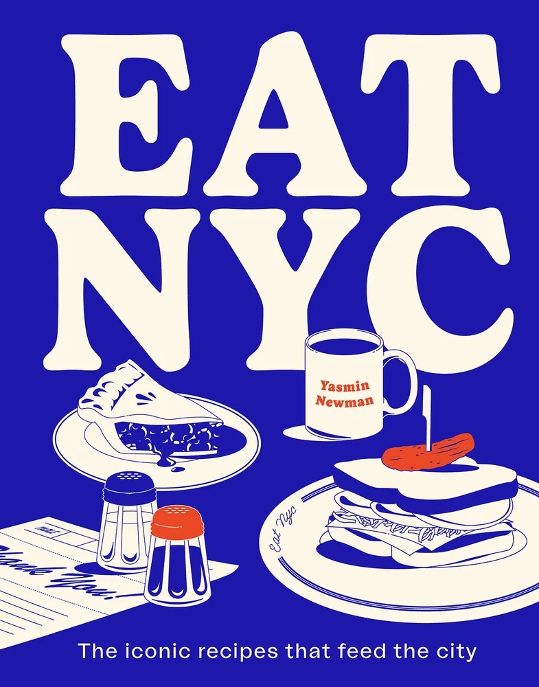
Everything about the packaging of this book is iconic NYC! From the illustrations, to the sprayed edges, to how the table of contents are laid out.
–Laywan Kwan
The type of cover that makes you go, “Damn it, I wish I designed this…”
–Jaya Nicely
The simplicity! I love a good fuzzy gradient.
–Vivian Lopez Rowe

Gorgeous use of white space. (Use your erase tool to knock out the quote bubble.)
–Mark Abrams
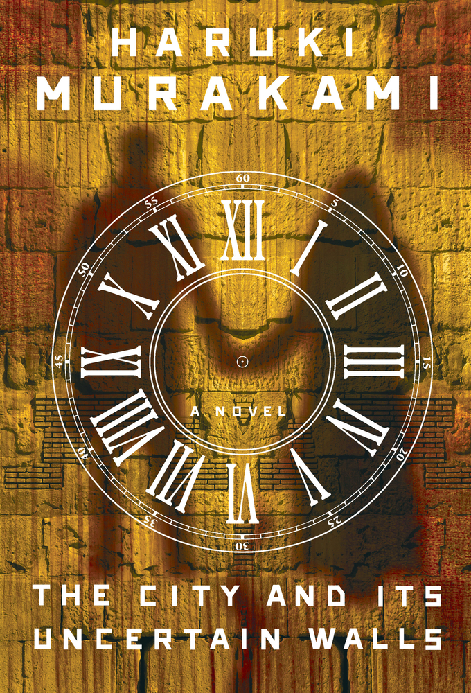
I included this cover because I’m so excited to read it! Murakami is one of my favorite authors. His work feels like a Southern Gothic style told through a Japanese lens, directed by David Lynch. Jeopardy!’s favorite book cover designer Chip Kidd really captures Murakami’s mysterious, yet human and relatable writing.
–Philip Pascuzzo

I’m a sucker for an original combination of images done in such an offhand, spontaneous, casual style. Dare I say, timeless and fresh all at once.
–Rachel Ake
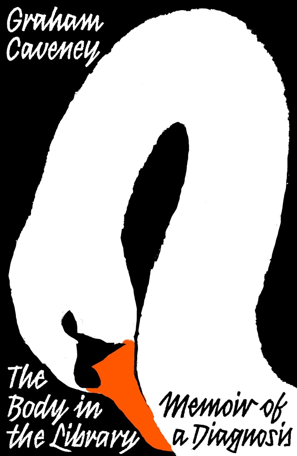
You never see a cover with a giant swan. I love it. I love how the swan is smushed and bent to fit in the space. Poor swan. The type marries sooooo nicely with the illustration style.
–Robin Bilardello
“It’s giving zine you were never cool enough to have stashed under your bed.”–Emily Temple ←YES
–Janet Hansen
The composition of the illustration, the limited palette–a beaut!
–Holly Ovenden
This cover is so cool and groovy and weird and wonderful!
–Laywan Kwan
Even with their 2D, flat illustrations, these covers feel incredibly dynamic, and I want to read these books knowing nothing about them. The curving type that envelops the illustrations are also really lovely!
–Kishan Rajani
I’m not sure I’ve seen a horror cover quite like this. It gives horror via sly—almost inviting—touches of sinister dread. Effective and well-done.
–Alban Fischer
Wow! Die-cut peepers too.
–Mark Abrams

All the type is on the stamps!! Perfection.
–Natalia Olbinski
It’s one of those covers that just gives you chills when you see it, both beautiful and unsettling.
–Jenni Surasky
So unexpected. Jarring, in a really good way.
–Dana Li

I was immediately drawn to the craft in this design. Visually, the cover feels like it was composed by one or both of the story’s sisters, and conceptually, natural elements held in suspension works so well for the book’s themes. This elegantly eerie cover begs to be displayed face-out.
–Jason Arias
Such fantastic colour and texture.
–Tom Etherington
I find something new to love in this design every time I revisit it. The colors, the textures, the scale(s), I love it all.
–Morgan Krehbiel
I can’t really explain why, but this image, this typeface and these colours just work together so beautifully.
–Jamie Keenan

This cover is so cute and fun and packs a ton of information into a tiny package.
–Laywan Kwan
These colors are amazing, and who doesn’t love a sheep?
–Eli Mock
Eerie, foreboding, surreal and undeniably cool. I love everything about it.
–Natalia Olbinski
Close your eyes and you can practically hear Steely Dan and Thin Lizzy riffing in the background.
–Matt Chase
Such an elegant design. Beautiful illustration and movement.
–Kelly Winton
Clever mirroring of art and type.
–Linda Huang
The type is beautifully positioned to frame this arresting image.
–Holly Ovenden

Henry has designed the PB series for these, and they’re all brilliant, but Tremor is my favourite. This cover so brilliantly captures the entrancing, fleeting visuals that this book evokes. The ink-trap type on this cover is also super confident and striking.
–Kishan Rajani

The lion’s teeth-as-title is just brilliant. The neon pink really makes the whole cover come alive.
–Sarah Schulte
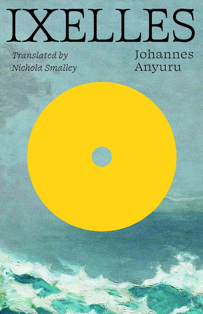
This is another cover that brought me to the purchase page to find out about the yellow shape which represents a golden cd that seems to be part of a pivotal moment within the text. Another juxtaposition of a modern clean element with a textured lush painting creating gorgeous tension and interest and a cover that stands out.
–Nicole Caputo

A paperback redesign that stops you in your tracks.
–Cassie Gonzales Vu
Such a great example of an organic illustration and hand lettering working together harmoniously. The limited color palette makes the cover even more striking.
–Kimberly Glyder
Scary-beautiful! I love the unique composition and the texture.
–Joanne O’Neill

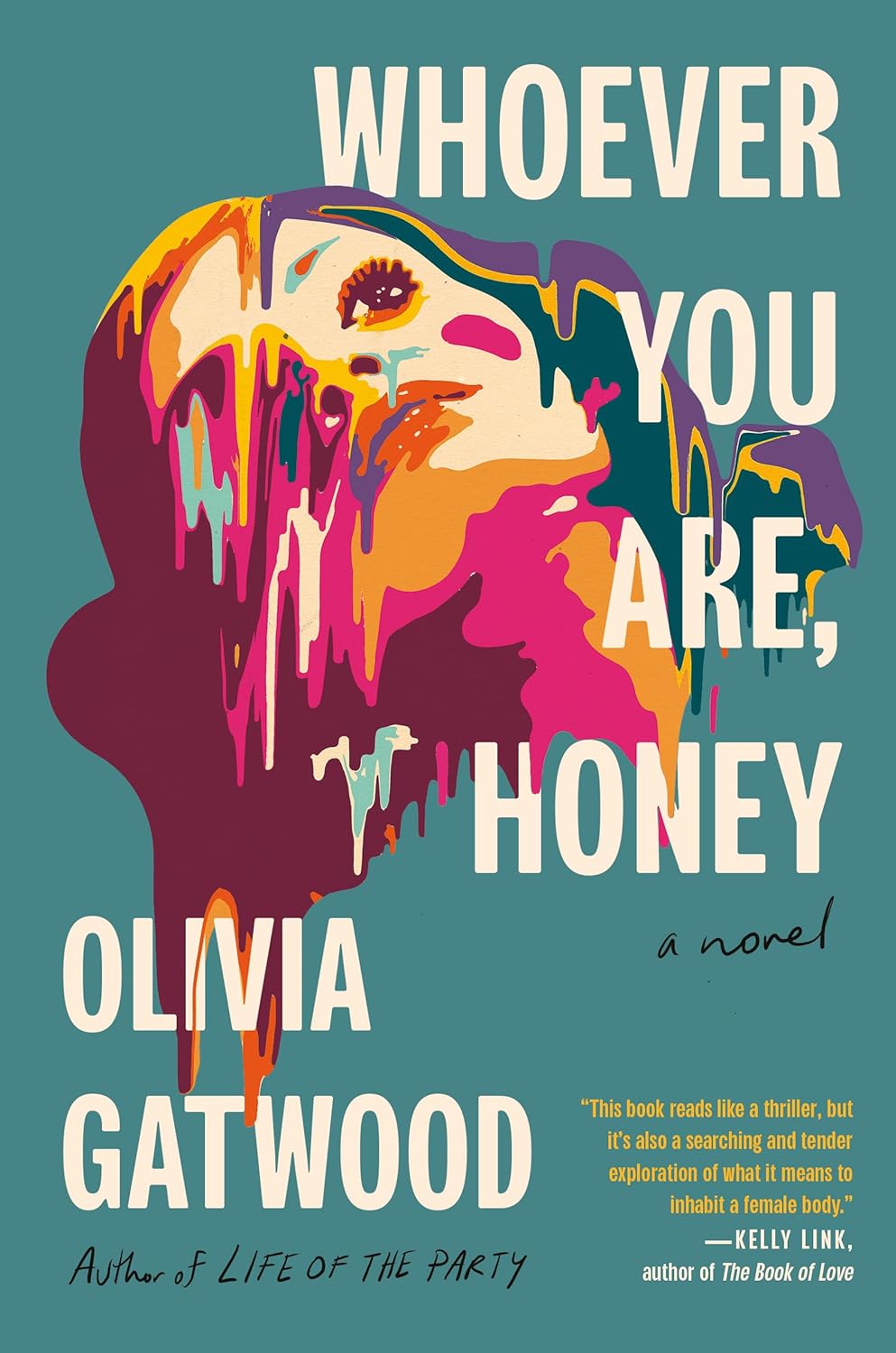
I am mesmerized by this shape-shifting sculpture, how it’s made of metal, but feels more like it’s composed of air, water, or even fire. It’s poetic in its own right while also capturing the collection’s theme. I take this one as a pleasant reminder that book covers don’t have to bring the energy of a theater kid during a manic episode to be memorable. Nothing against theater kids.
–Jason Arias

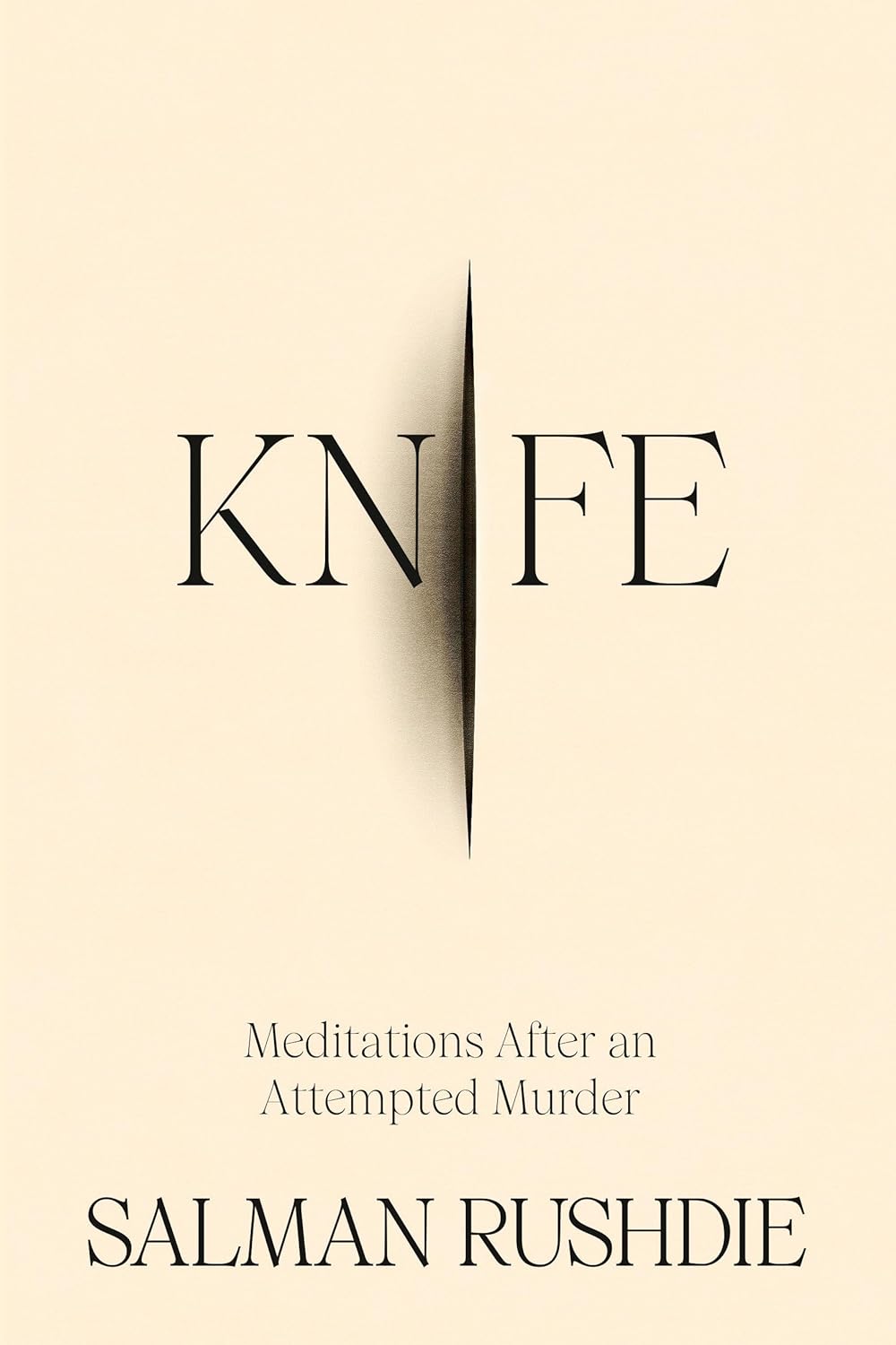
I love the reverse contrast on the type against a white background, the brutal cleanliness works so well with the severed finger.
–Tom Etherington
Matt’s brain is something else. Beautiful.
–Arsh Raziuddin
I hope this cover exists in every universe. The shimmering portal calls to me as a designer and as a reader.
–Morgan Krehbiel
The colors, the patterns, the movement!
–Dana Li
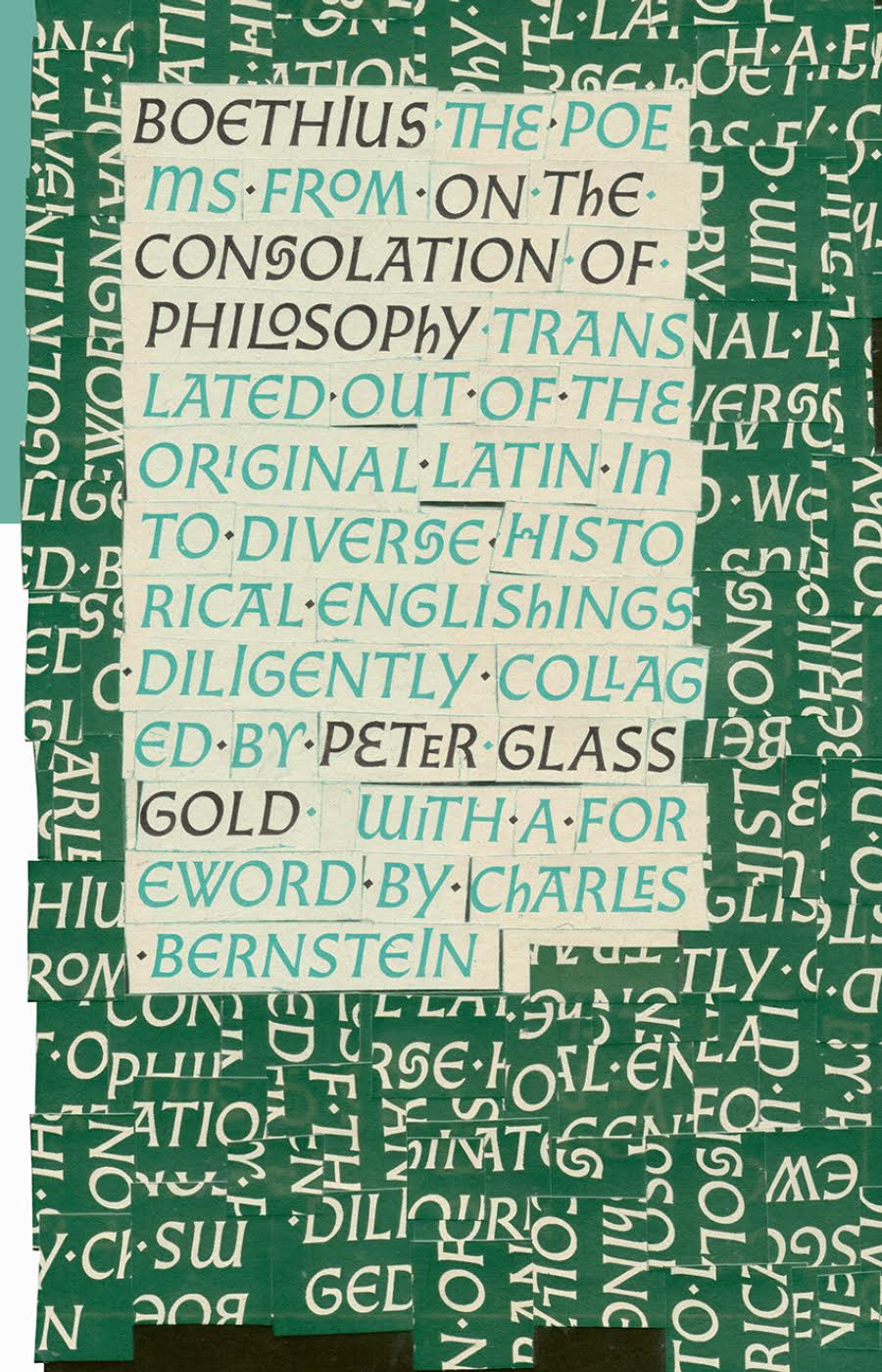
Andrew Bourne continues World Poetry’s run of stunning book designs. The cut-up type here is the perfect analogue to the translator’s approach in reshaping a centuries-old work.
–Alban Fischer

The collaging of textures, artwork and photography gives warmth and richness to a seemingly very simple composition. Like the very best design, the result looks effortless.
–Jaya Nicely

All the covers I’ve seen in this series have been so bold, colourful and captivating, I love them!
–Kishan Rajani

Three immediately recognizable women, and an evocative title make such a strong design. You want to ask them and know the story through their eyes.
–Lauren Harms
I bought this in a real life bookstore when I saw it. I was like POW I gotta have that. Also, maaannnnnn, how she’d get that approved. Dang.
–Robin Bilardello
It reminds me of rainbow scratch art from childhood!
–Cassie Gonzales Vu
Aslak Gurholt designs all the books for Norwegian publisher Flamme Forlag, whose covers remind me more of record companies like Factory and ECM than publishers. There is stripped back, minimal aesthetic that runs through all of the covers designed by Gurholt for Flamme, without it ever becoming a ridged template. In an increasingly sales driven industry, it’s refreshing to see a publisher do something so unique and interesting.
–Tom Etherington

Covers that transcend their main purpose will always capture my heart. This kind of design thinking buoys publishers among the POD squall.
–Jason Arias

Restraint! Beautiful.
–Arsh Raziuddin
Gorgeous and dreamy. The color palette feels unique and fresh.
–Sarah Schulte
I’m obsessed with the curved type on this cover. It really leads your eyes across the entire design.
–Jenni Surasky
Subtle and simply beautiful.
–Cassie Gonzales Vu
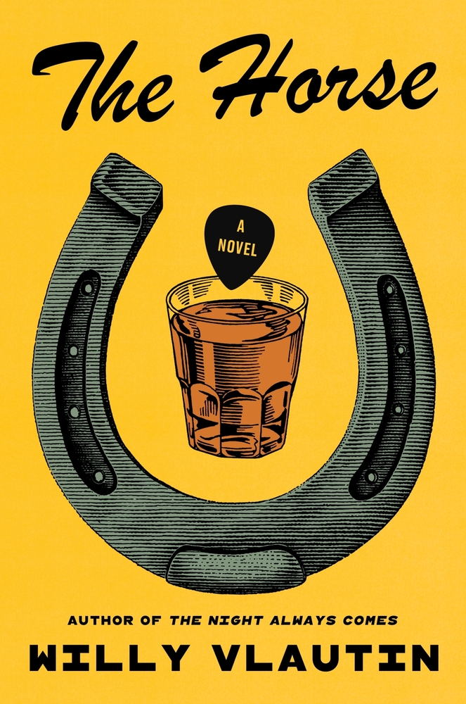
My daughter brought this book over to me in a bookstore and said, “I like this one because I like horses and I like orange juice.”
–Robin Bilardello
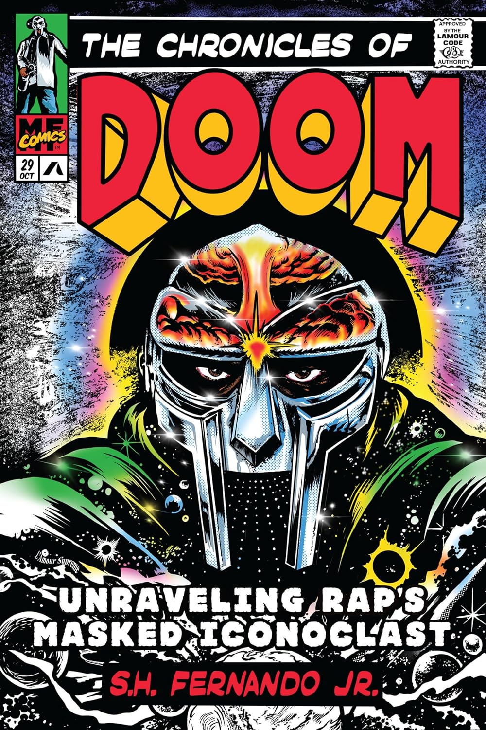
All about this comic book treatment and its details. The artist’s seal of approval on the top right is genius.
–Stephen Brayda

Micaela’s redesign of these books is nothing short of masterful. Each cover is brimming with intricately illustrated elements that seamlessly come together in perfect harmony. These designs are truly captivating, inviting you to pause and savor every stunning detail.
–Kishan Rajani
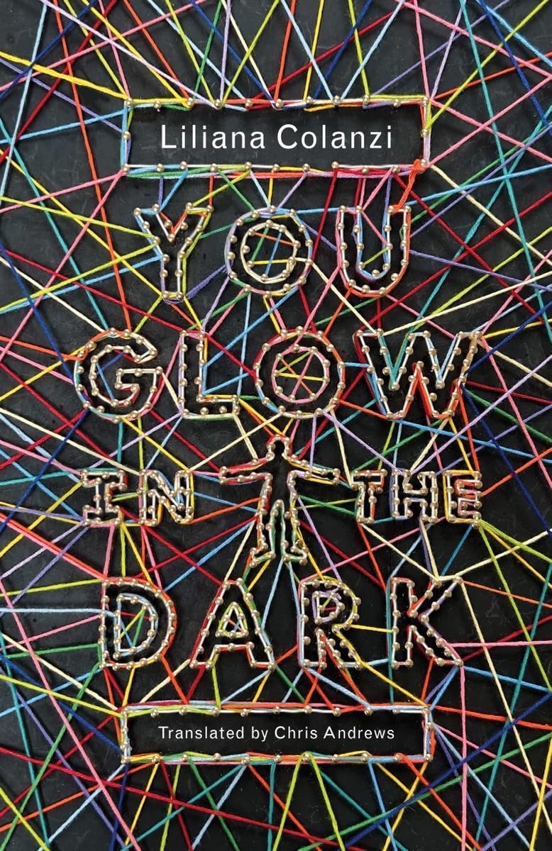
Big fan of this arts and crafts project!
–Stephen Brayda
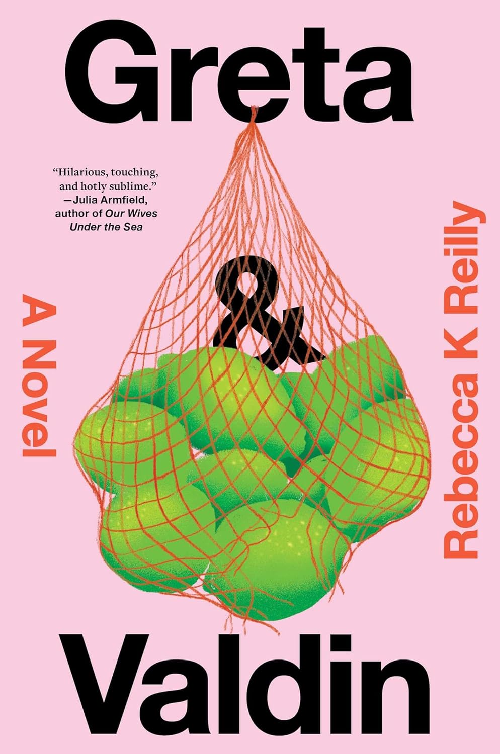
Love the simplicity and title play with the bag of limes.
–Jaya Miceli
Absolutely love new and creative ways to execute a silhouette. Will nailed it!
–James Iacobelli
I love the evocative combination of image and title.
–Stephanie Ross
Love the use of clip art and playful type.
–Jaya Miceli
Such energy! Everything about this is bold, and pulls me in. Great palette too.
–David Litman
The infinite books on books is done so well here. Wonderfully simple.
–Stephanie Ross

So bold and striking.
–Jaya Miceli
My favorite spy novel cover this year. Pete created a fresh and simple series look!
–James Iacobelli
Clever and warm.
–Jaya Miceli
Ironic Consolation Prize:
“I acknowledge that differing viewpoints are a natural aspect of human relationships.”
–Mark Abrams